Play MPE
Play MPE supports the distribution of new music releases from indie to mainstream artists and labels across radio and media spaces.
ROLE
End-to-end creation of the design system, while supporting Developer adoption. Overhauled existing features and designed new updates with user-centric principles across two digital products.
team
Generally company-wide, but specifically, 2 Designers (Myself and Elvina P.), 3 Product Managers, 3 Directors, 5 Developers, and 1 Quality Assurer.
DURATION
July 2022 - February 2024.
My time at Play MPE
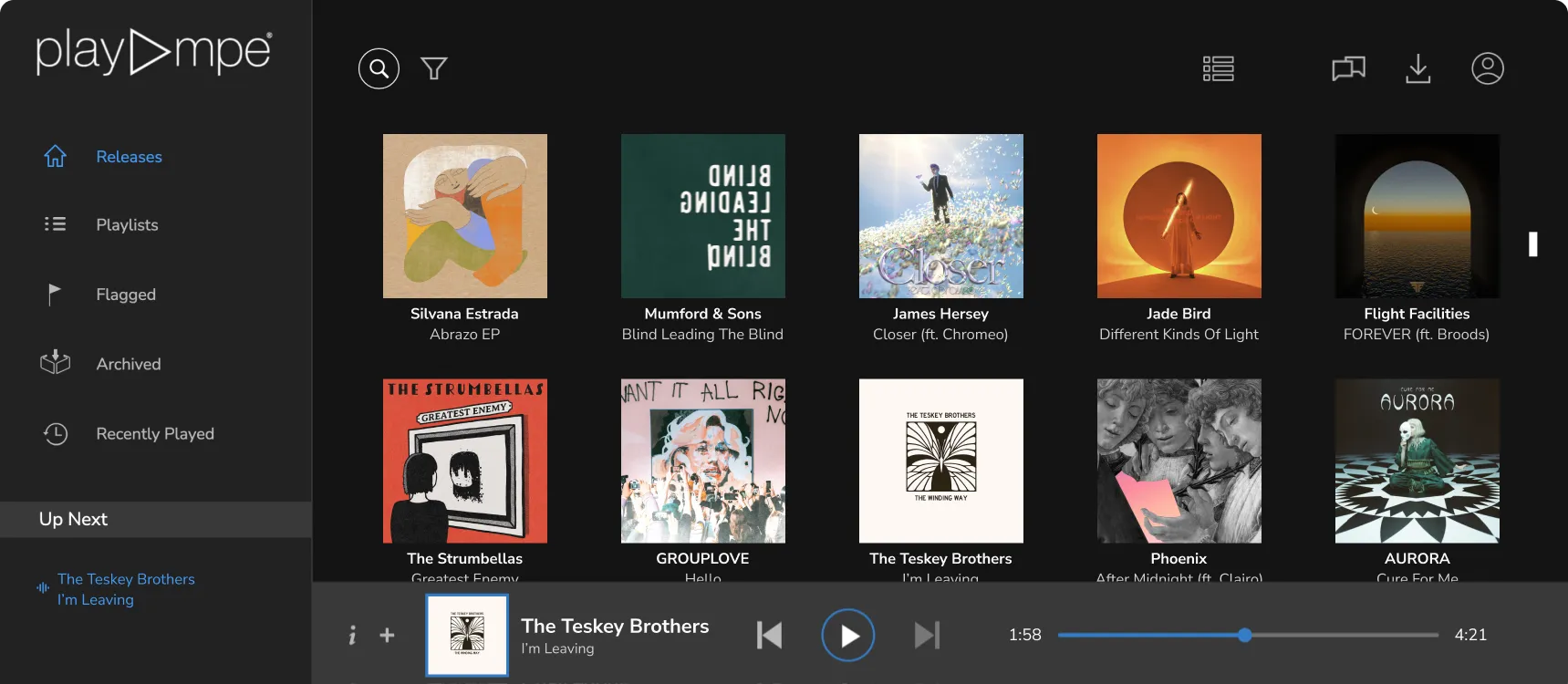
Play MPE supports the music distribution of mainstream/indie artists and labels (like Universal Music Group and Sony Music) in promoting new releases across radio and the media space.
Under the Play MPE brand, three products — Caster, Player, and MTR — operate together to create the spectrum of music distribution, consumption, and radio monitoring. As one of two Product Designers, a primary responsibility was designing and upholding the design system (Tonality) while guiding the Developer team's implementation of it.
I was also responsible for Caster, the heartbeat of Play MPE. It is where artists assemble their music releases for distribution to music promoters, radio stations, and media. As Play MPE did not previously have the resources to prioritize design advocacy or usability principles, my time on Caster involved identifying and amending usability violations, redesigning interfaces, and implementing new features. I also handled design requests from our biggest clients, Universal Music Group (UMG) and Sony Music.
I also co-designed MTR, the radio airplay tracking platform for artists, which was done from conception in collaboration with the other designer until its launch.
Dive into a project below or continue reading about general outcomes at Play MPE!
Tonality Design System
✦ Building a design system with Developers
Top Charts
✦ Redesigning music ranking charts for artists
MTR (Coming soon!)
✦ I haven't written about this yet!
Evolving Caster
✦ A multi-phase redesign for self-checkout implementation
learning outcomes
How I created a structure for design pass-off and stakeholder buy-in
Prior to the design system and me joining the team, communications between Product Managers, Designers, and Developers were not transparent, which resulted in poor outcomes. The factors that led to this were as followed:
First, attendance for design hand-offs were not strict. This resulted in a struggle to get everyone on the same page, as concerns would never be voiced collectively, let alone documented, regardless of who those concerns came from. Shared mockups were not annotated or broken down by states, so intended functionalities were ambiguous. This lacked clarity to those who tried to review designs.
Second, missed meetings and sparse documentation resulted in an ill-defined blueprint for Developers. This enabled discrepancies to exist between design and developer work, as many outcomes were based on individual interpretation of how designs worked — rather than explicit criteria of what's intended. At this time, design reviews were also not baked into the development process, so discrepancies were made live to public.
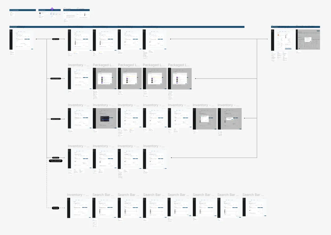
As these standards were normalized, the gap for what was designed and what was built grew bigger over time. My duty was implementing a design system and due process to create structure and agreement between all parties involved along the pipeline.
To answer for design documentation, the Design team began to annotate all designs to eliminate confusion. For posterity, these notes would supplement an understanding for any requirements or concerns raised by those in attendance, as well as general notes by the Designer about the design to reduce ambiguities or misinterpretations.
First, attendance for design hand-offs were not strict. This resulted in a struggle to get everyone on the same page, as concerns would never be voiced collectively, let alone documented, regardless of who those concerns came from. Shared mockups were not annotated or broken down by states, so intended functionalities were ambiguous. This lacked clarity to those who tried to review designs.
Second, missed meetings and sparse documentation resulted in an ill-defined blueprint for Developers. This enabled discrepancies to exist between design and developer work, as many outcomes were based on individual interpretation of how designs worked — rather than explicit criteria of what's intended. At this time, design reviews were also not baked into the development process, so discrepancies were made live to public.
As these standards were normalized, the gap for what was designed and what was built grew bigger over time. My duty was implementing a design system and due process to create structure and agreement between all parties involved along the pipeline.
To answer for design documentation, the Design team began to annotate all designs to eliminate confusion. For posterity, these notes would supplement an understanding for any requirements or concerns raised by those in attendance, as well as general notes by the Designer about the design to reduce ambiguities or misinterpretations.
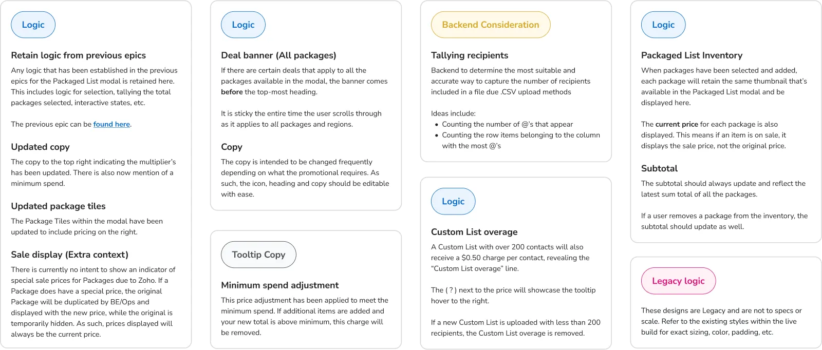
Examples of annotations appended to designs
The other designer and I also created universal rules that would be applied to components used in our designs. This included guidelines on component interactivities, state transitions, and color usage. These rules were made available on both the Design System located in Figma and a separate documentation hub in JIRA.
Another integral part of design documentation was versioning. After each round of Stakeholder and Developer buy-in, if major changes were made, we would branch our design into a new version. This enabled us to create an archive that allowed anyone to see the evolution of designs decisions over time.
Another integral part of design documentation was versioning. After each round of Stakeholder and Developer buy-in, if major changes were made, we would branch our design into a new version. This enabled us to create an archive that allowed anyone to see the evolution of designs decisions over time.
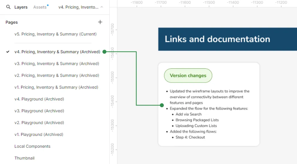
Tile card indicating changes between each version of design
Version 3 of designs
Version 4 of designs
Advocating for design and usability
As Play MPE had low design maturity, the design team often needed to advocate for the importance of how basic design principles and small changes could bring goodness to the platform. Yet, because design improvements were not always directly tied to a monetary value, it often got discounted for not being beneficial towards business objectives — even if it created better usability experiences. Regardless of company or maturity, this is an important quality to foster as it built confidence and goodwill in the user's perception towards the experience of the products they use.
A stance the Product team generally had to negotiate was receiving permission to address quality-of-life changes (often requested by users) depending on whether that change or feature was revenue-generating. This largely impeded beneficial upgrades that made the system easier and more efficient to use.
For instance, many text fields in Caster with hoverable tooltips provided little value to users as they lacked descriptive explanations (and consistent styling). For newer clients to the platform, they often filed a support ticket asking for further instructions with the anticipated input.
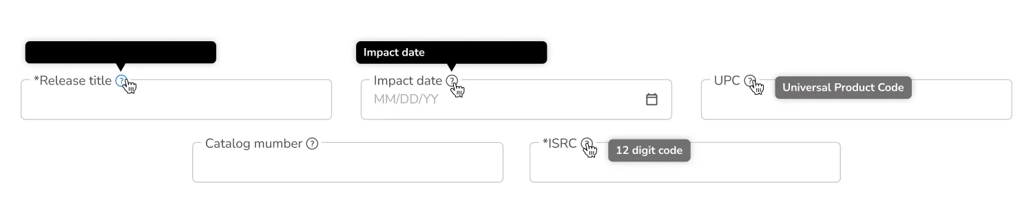
text fields and their hoverable tooltips
As an example, although one could infer that Impact date is when music is released and makes its mark among consumers, it is actually the date in which radio stations can begin prep-work, such as adding it to playlists or coordinating for broadcasting. This differs to Release date when music is made available to the general public. This distinction was not information presented in the tooltips.
With the styling inconsistencies, this was attributed to the problem of locally-coded components. At a surface level, global components disseminate the same styles and behaviors across all its copies, but a local component is unaffected as it was created independently with its own rules. Prior to the design system, local components were used liberally and caused discrepancies like different styling to emerge. Although they may be similar, they are definitely not the same. Like this cow! Wait... that's not a — anyways...
With the styling inconsistencies, this was attributed to the problem of locally-coded components. At a surface level, global components disseminate the same styles and behaviors across all its copies, but a local component is unaffected as it was created independently with its own rules. Prior to the design system, local components were used liberally and caused discrepancies like different styling to emerge. Although they may be similar, they are definitely not the same. Like this cow! Wait... that's not a — anyways...

Concurrently, empowering users should be a non-negotiable, and although this may not have an explicitly perceivable effect on revenue increase, clarity and consistency to system processes allow users to build confidence in using our products. This would reduce troubleshooting on behalf of clients, freeing up time and manpower, which is adjacently expense-saving!
It may seem like a small issue, but if users are unable to proceed on their own, how does that impact their likelihood of repeated use? The long-term journey counts too!
While it was seldom we could tackle these issues independently, the design team compromised by delivering improvements if it was in a related area of larger-scale tickets. This way, although it would never be an update on its own, we still had the chance to address long-standing concerns. We do our best where we can!
Tonality Design System
✦ Building a design system with Developers
Top Charts
✦ Redesigning music ranking charts for artists
MTR (Coming soon!)
✦ I haven't written about this yet!
Evolving Caster
✦ A multi-phase redesign for self-checkout implementation
© jeffrey chan, 2026.