PLAY MPE
Top Charts
A redesign of the Play MPE Charts that feature the top songs distributed through the platform.
Role
Sole Designer for the revamped Top Charts, and delegated with the Contractor. Conducted user research and project specifications with Product Manager. Primary Quality Assurance Tester for deliverables returned from Contractor.
Team
Myself (Sole Designer), 1 Product Manager, 3 contributors from Business Development, 1 internal Backend Developer, and an external Development team.
TIMELINE
Five months.
Overview
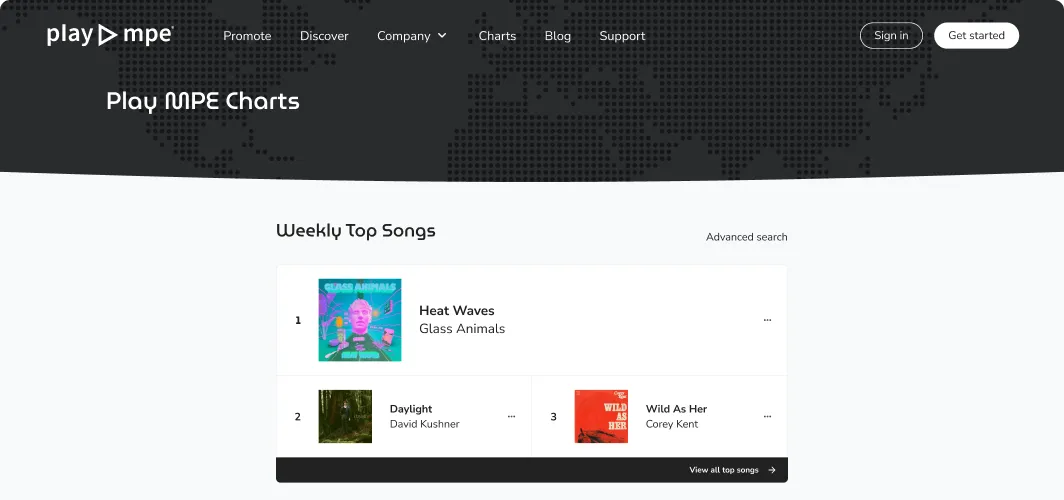
Play MPE Top Charts is a redesign of the previous Play MPE Daily Charts. It spotlights artists that have achieved the highest streaming/download numbers overall or of their respective region/formats (explained loosely as genres) through the Play MPE platform.
Product research and requirements were previously determined prior to my time at Play MPE, but additional research was scouted and synthesized over 2-weeks by myself and the Product Manager for updated knowledge. I spent another 2-weeks to complete the design process from ideation to final deliverable, which was then contracted externally to a Development team who delivered the project in four months. Quality Assurance (QA) was conducted over one month, where I was also a primary tester.
Internal staff avoided promoting the old Charts as it was "awful, ugly, and presents inaccurate data," so the main objective of the redesign was modernizing the aesthetic and updating format offerings to provide better value to artist and radio people. (Although as far as designs go at Play MPE, I personally didn't think this was an aesthetic offense.)
old play mpe charts homepage
pain points
Arbitrary restrictions on artist representation
In the previous iteration of the Charts, ranking options were limited to only 5 formats and regions, severely restricting the number of artists who were represented on the Charts.
At the same time, charts were also tabulated on a release-level, meaning Albums and its songs were tallied as a whole against Singles — standalone songs. Singles were wholly disadvantaged in competition to Albums on the same chart, as the latter would have an inflated score.
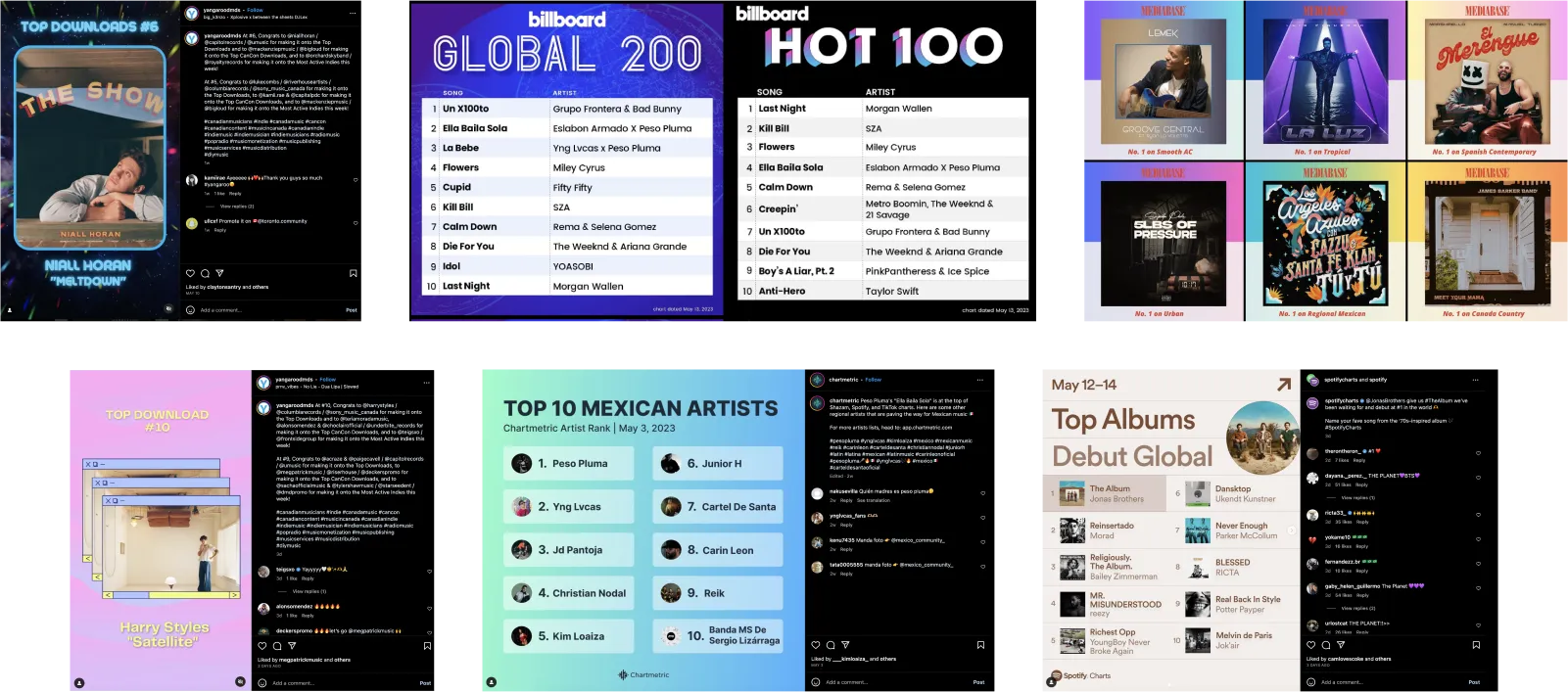
Lastly, artists frequently screen-grabbed their chart positions and created their own graphics. This created two problems. First, it put the chart's aesthetic on display, which internal teams did not enjoy. Secondly, artists were eager to share their wins but were limited by the lack of a share feature. Many couldn't even share because their music wasn't represented on the charts. From my research, no one was able to say why there was a limitation on regions and formats. In fact, it seemed like it was superficial.
At the same time, charts were also tabulated on a release-level, meaning Albums and its songs were tallied as a whole against Singles — standalone songs. Singles were wholly disadvantaged in competition to Albums on the same chart, as the latter would have an inflated score.
Lastly, artists frequently screen-grabbed their chart positions and created their own graphics. This created two problems. First, it put the chart's aesthetic on display, which internal teams did not enjoy. Secondly, artists were eager to share their wins but were limited by the lack of a share feature. Many couldn't even share because their music wasn't represented on the charts. From my research, no one was able to say why there was a limitation on regions and formats. In fact, it seemed like it was superficial.
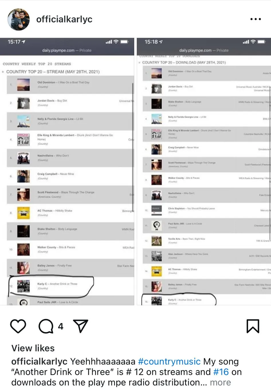
artist's screengrab of their charting song
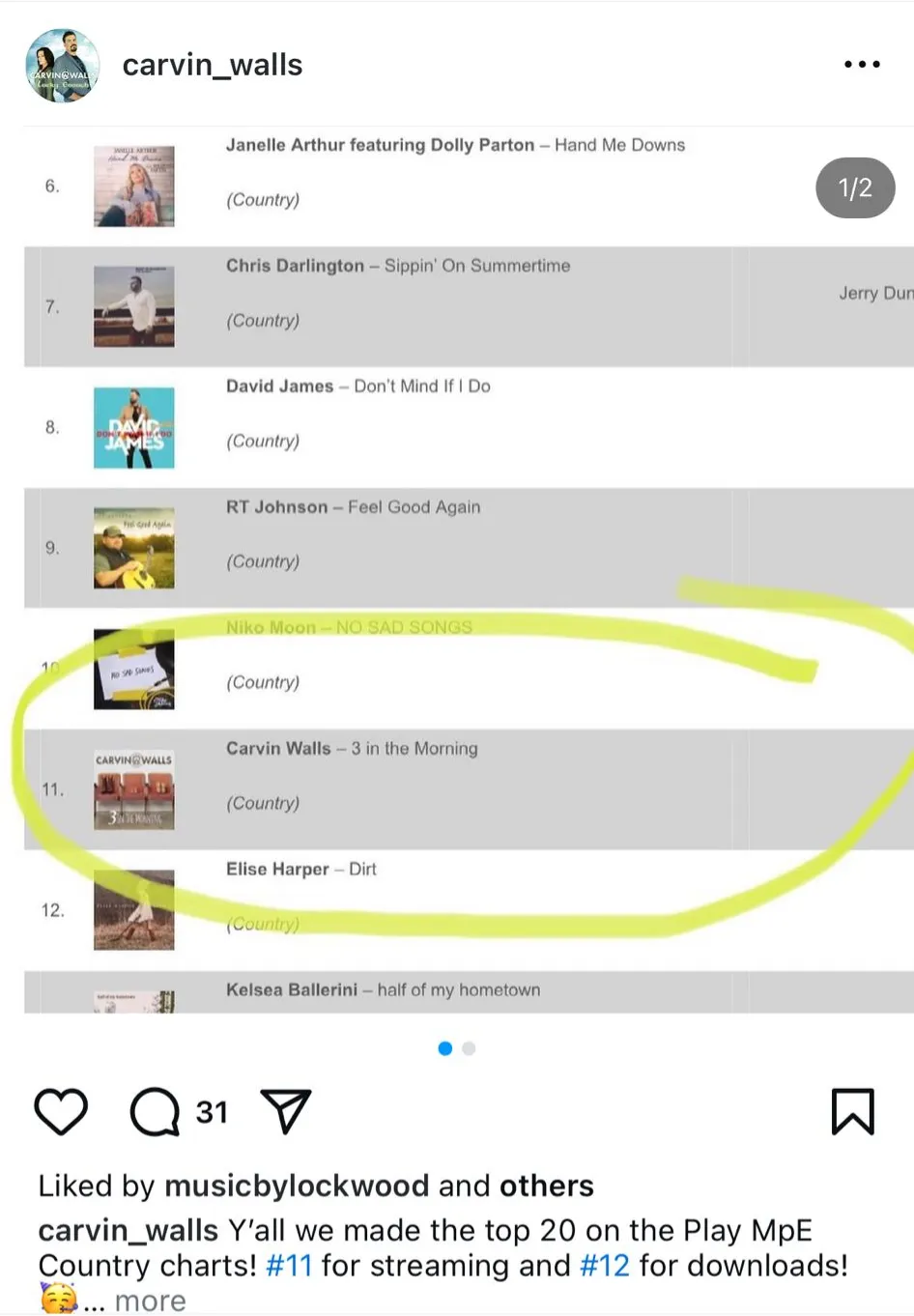
artist's screengrab of their charting song
This squarely defined the priorities of this project to expand category offerings and to create opportunities for social sharing. Doing both would subsequently increase the number of artists shown on the Charts, while also allowing them to share to social media to boost their own accolade and Play MPE's brand passively.
problem space
How can we improve the Charts to expand genre selections, help with music discoverability, and enable social sharing?
design
Brand identity with a lukewarm reception
One important product requirement was unifying the Chart domain with the primary Play MPE website. The old Charts existed on a subdomain and the Marketing team noted that the disjointed collection of Play MPE products scattered our traffic and SEO. It also meant that the Charts were largely undiscoverable since it was not linked to the primary website and was not marketed anywhere.
To create brand cohesion, the Charts would have to follow the primary website's branding — but the identity not been consistently well-received from current and prospective clients and various internal teams.
To create brand cohesion, the Charts would have to follow the primary website's branding — but the identity not been consistently well-received from current and prospective clients and various internal teams.
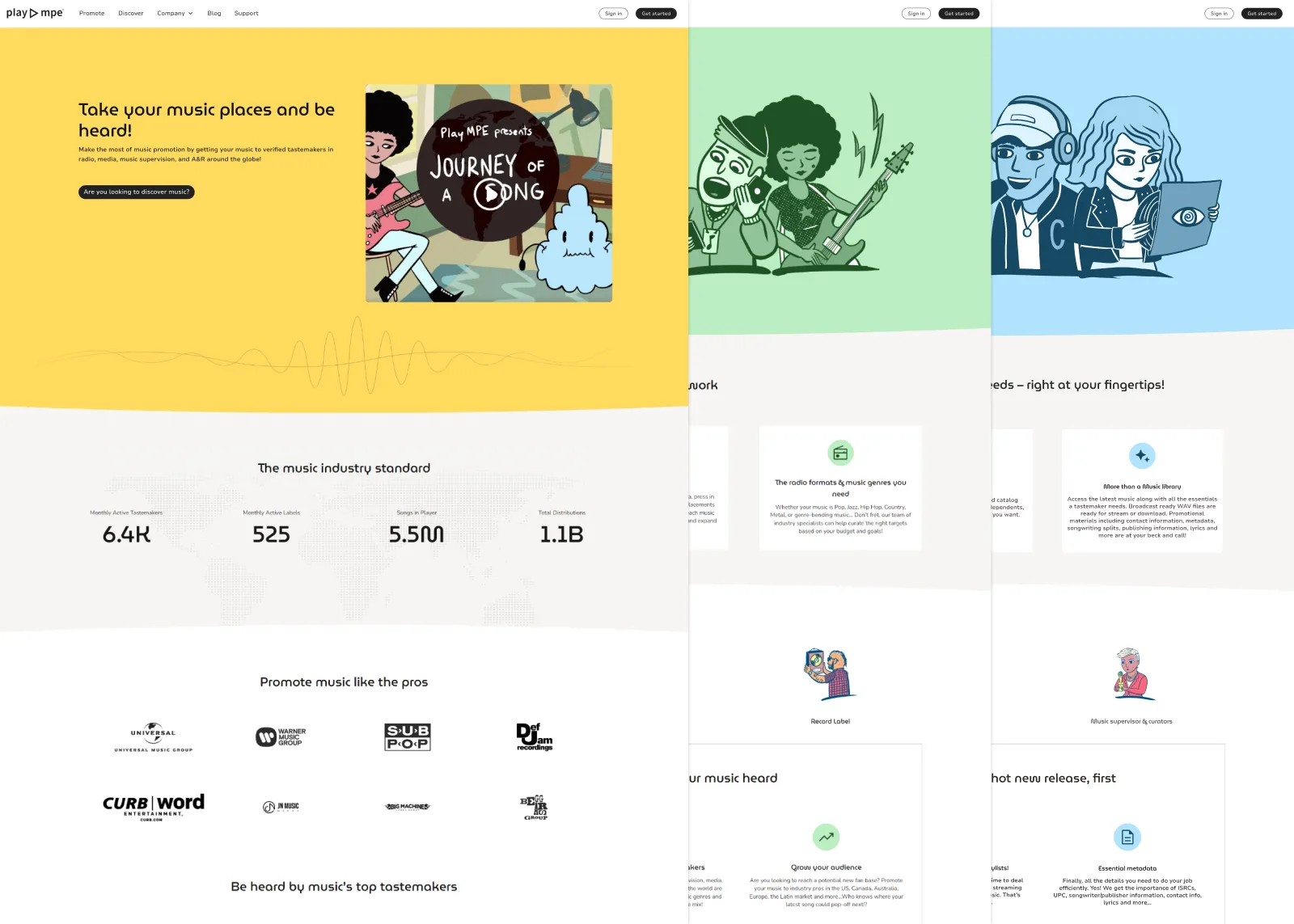
MAIN play mpe website
From purely an aesthetic point of view, the overall vibe of the website felt too cutesy for our subject matter, which comes from the vast color palette, character illustrations, and display font. I had the challenge of designing the Charts to match the branding, yet shying away from the cutesyness and the qualities that left a mid reception.
One benefit of the website was that the colors each represent a different subject. Instead of leaning towards color, I opted to go black and white to keep things neutral, which still fit with the color-to-a-topic theme. This opportunity also allowed for more focus on the album art, without entirely clashing with the variety of visual elements in album covers.
I retained all the features that were present on the main website such as the typography, rounded buttons and the softness of edges. I reused the dotted world-map to create some connection between the two domains, while also using it for depth in lieu of the illustrated heroes. Otherwise, the hero section would simply be a flat, solid color.
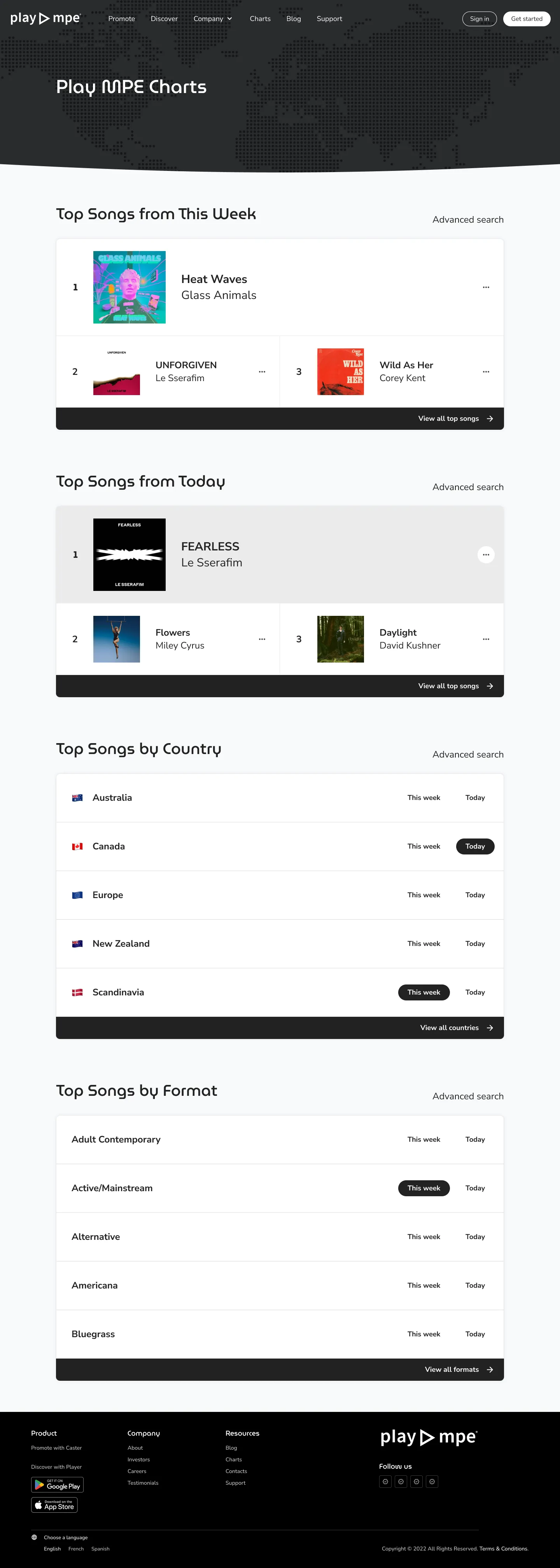
In the previous version of the Charts, a simple dropdown was sufficient for format selection, but this would not suffice for the new design as we had intended to expand the choices for region and format.
These categories come from the Caster side. When a user distributes music using Caster, they select from a list of radio recipients in a certain region that broadcast a specific music format. Effectively, anything that is selectable in Caster, we wanted it to be selectable on the Charts as well.
Given this sizable expansion, we needed flexible filtering for users to parse through the available formats and regions. I once saw a design pattern as what I'll dub as a statement-selector, which presented itself as a complete sentence, but allows the user to change parameters to alter the search results - which is what I aimed to implement here. I could not for the life of me find a practical and live example for my developers, but if you know what this is called, please let me know!
The idea behind this prototype is that users can pick and choose which parameters they want in their search query. For options that are not filled out, they default to the most general yield.
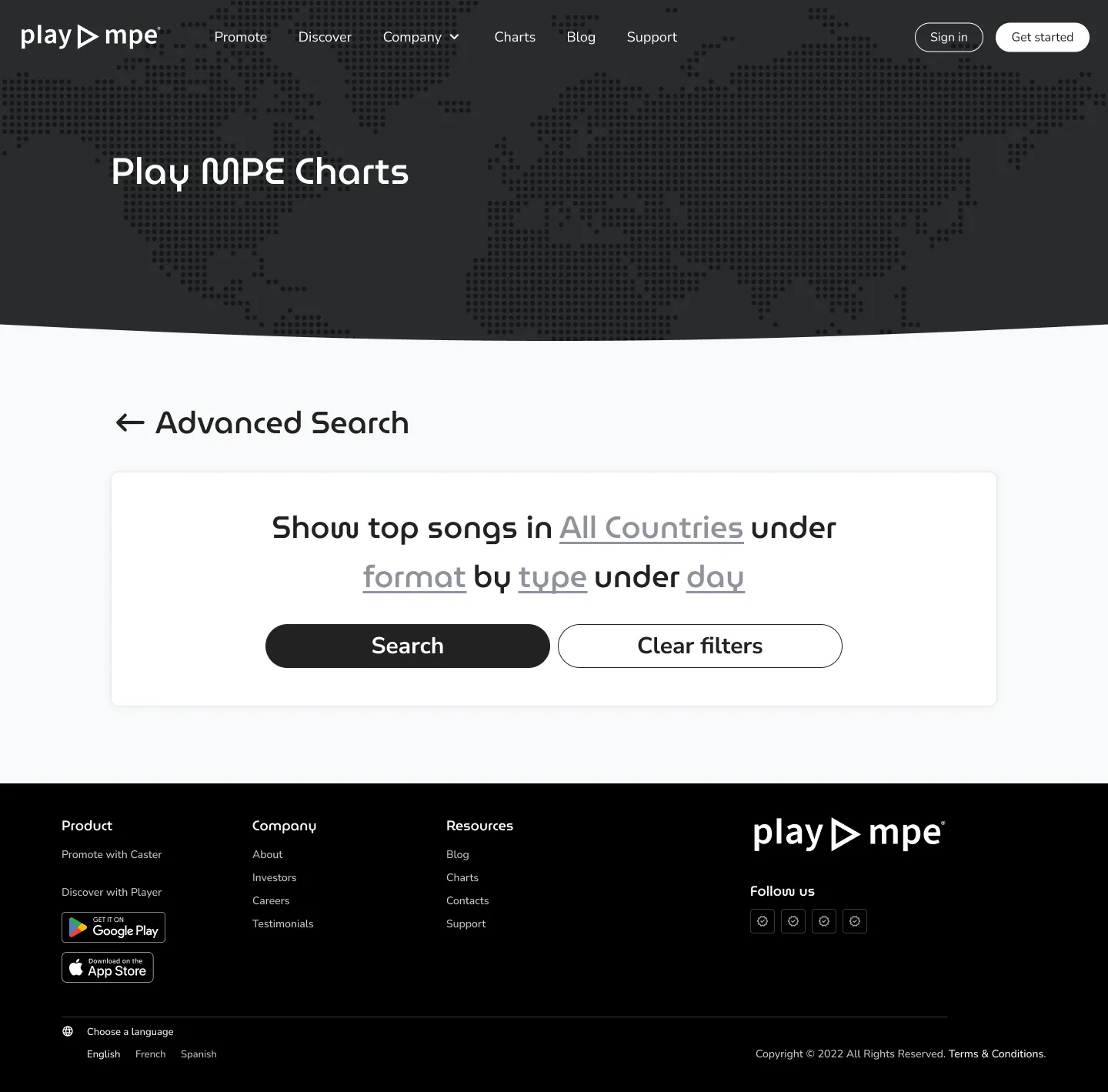
advanced search
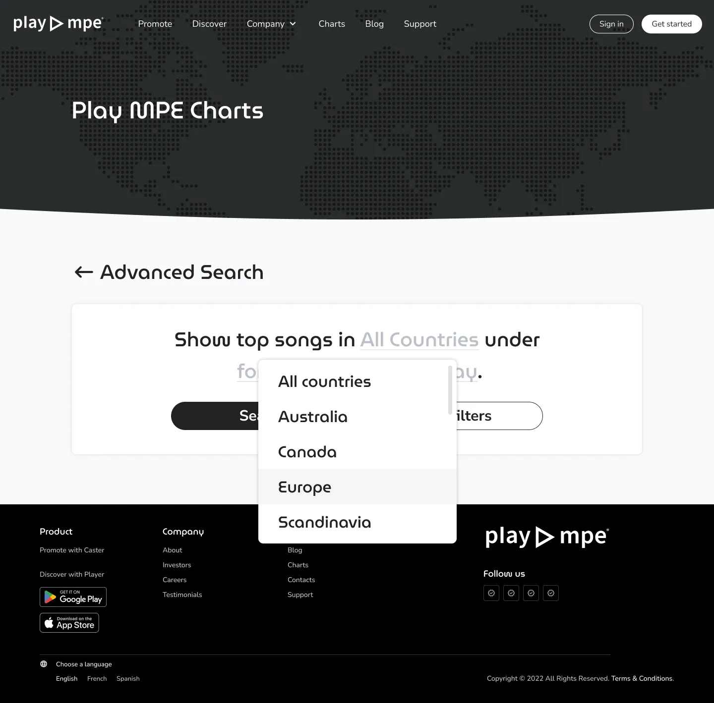
advanced search: country dropdown
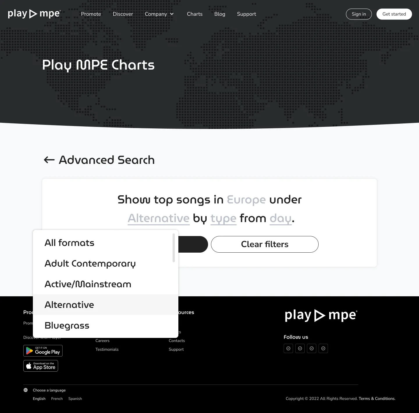
advanced search: format dropdown
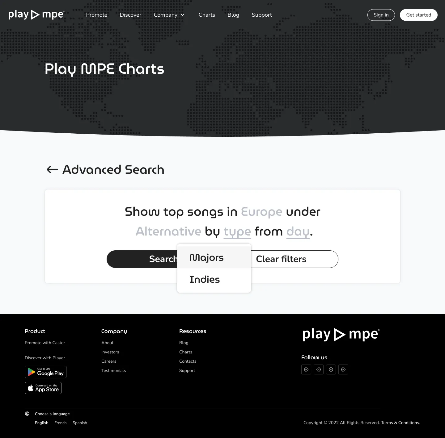
advanced search: TYPE dropdown
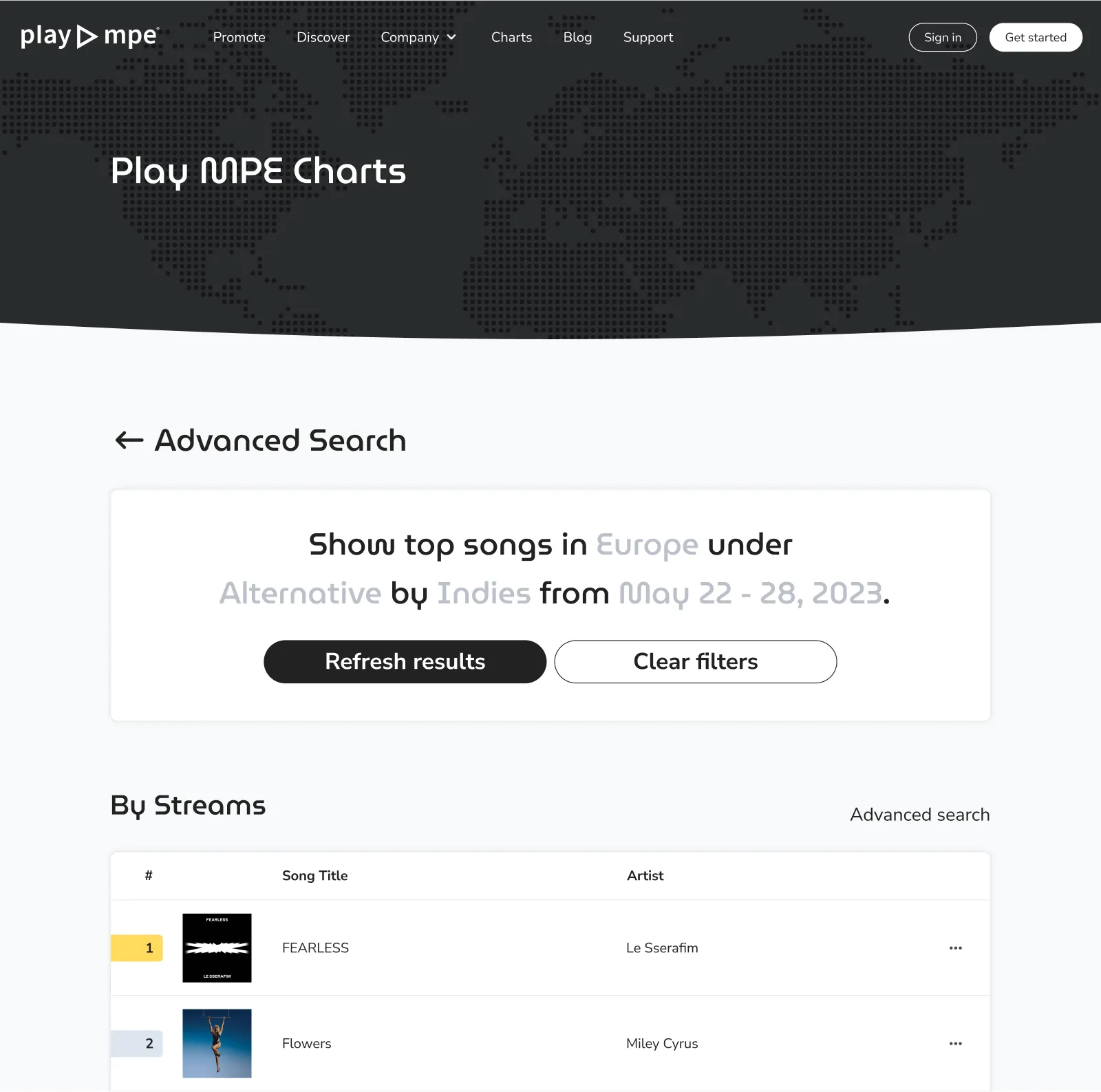
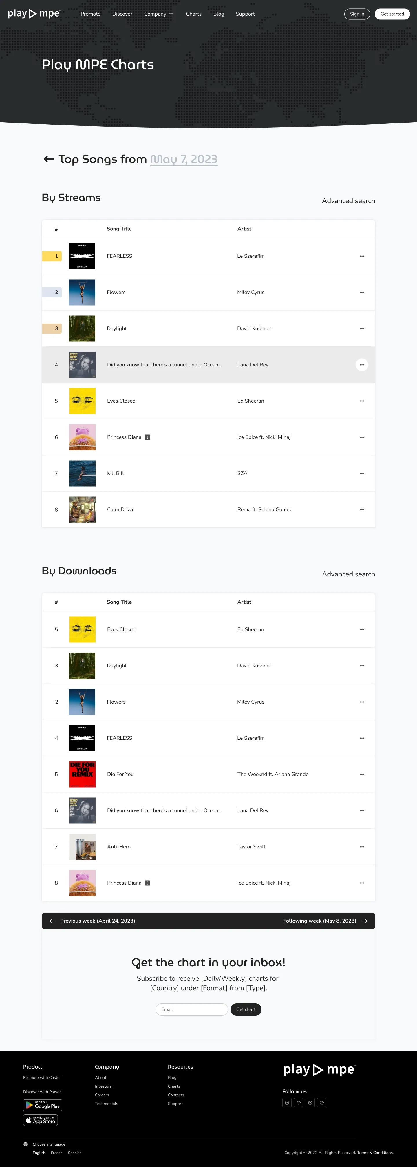
advanced search: results
As you can see the above, the final search would pull from the results requested by the user. It also provided flexibility by showing the search query once again, so the user could easily tailor their prompt to make another search.
In the end, the final design for this stayed more or less the same, but the team did spend a significant amount of time working on the prompt language as we needed to use clues that would work regardless of whether the prompts were fully filled, partially-filled, or unfilled. For example, "type" became "Label type" and was given an "All labels" dropdown option to truly satisfy the versatility required of the field.
We also needed to account for error and empty states in the event that the combination of queries resulted in a configuration that didn't exist. I'm pretty sure I was living a Day in the Life of a prompt writer at Cards Against Humanity.
SOCIAL SHARING
Compelling action with the element of coolness
For the social shares, considering that the Chart was getting a sleeker, cooler feel, I wanted a similar vibe that represents this upgraded branding. Even though we were using black and white, I was eager to bridge in the color palette that was used on the main website as the social share would have a greater focus on the brand. In this context, it's no longer just about the Chart, but the brand being represented — it's Spotify's chart, it's Apple's chart, it's Play MPE's chart.
To gather inspiration, I looked at charts from various competitors and companies that exist within the music-space. One prominent feature between these designs were the usage of color, imagery and complexity depending on whether a single song or a collection of songs were being featured.
To gather inspiration, I looked at charts from various competitors and companies that exist within the music-space. One prominent feature between these designs were the usage of color, imagery and complexity depending on whether a single song or a collection of songs were being featured.
social shares from competitors and other industry figures
With generating opportunities for clients to share their music, the customization of the options provided was also important as we want to provide versatility for how the shares could be used. We wanted to give clients the option of selecting a social share that solely featured their music and their achievements, but, for certain artists, sometimes the gravity of their charting could mean more if other artists were shown in context.
Imagine this — placing 2nd on the Country chart is major cool, but imagine coming second to none other than Dolly Parton, who is in 1st? So obviously, it made sense to create graphics that allowed for both a single spotlight and a group spotlight.
Unfortunately, the Engineering team had vetoed the group spotlight due to a technical limitations with the way chart rankings were recorded. This sadly narrowed my scope, but I still had the opportunity to work with the different dimensions as required.
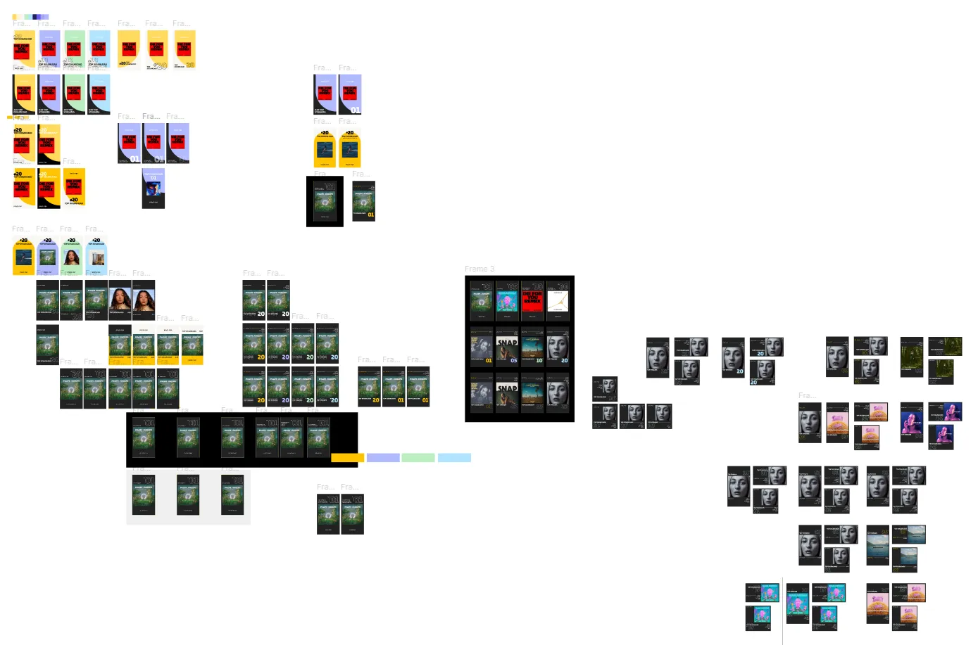
iterations of social share
One of the challenges with designing the social share was accommodating for the different string combinations and the spaces they occupied. Since Streams and Downloads would be two ranking categories, I had to design around the word "Downloads" as that occupied more space. This concept applied for the rank position, the time range, the region, and the format. Depending on what the user selected as their filtering criteria, certain information would have been present or absent.
This challenge was further elevated when it came to arranging the layout for the different dimensions - such as Twitter and Facebook, which is more horizontal, and Instagram posts, which is squared. In order to keep some consistency between the three, I did my best to follow Western-reading conventions, so that the Chart placement for Stream and Download would be as close to the left-side, if not to the top-left quadrant.
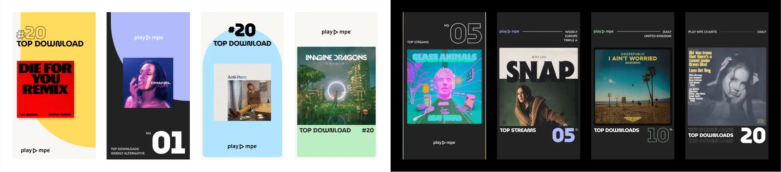
With the bridge to the brand colors, the generated social share would have its color determined by the placement on the Charts. This gave room to a more dynamic visual that changed for every song. Baring these elements together, the final design was what we settled with down below:
This challenge was further elevated when it came to arranging the layout for the different dimensions - such as Twitter and Facebook, which is more horizontal, and Instagram posts, which is squared. In order to keep some consistency between the three, I did my best to follow Western-reading conventions, so that the Chart placement for Stream and Download would be as close to the left-side, if not to the top-left quadrant.
With the bridge to the brand colors, the generated social share would have its color determined by the placement on the Charts. This gave room to a more dynamic visual that changed for every song. Baring these elements together, the final design was what we settled with down below:
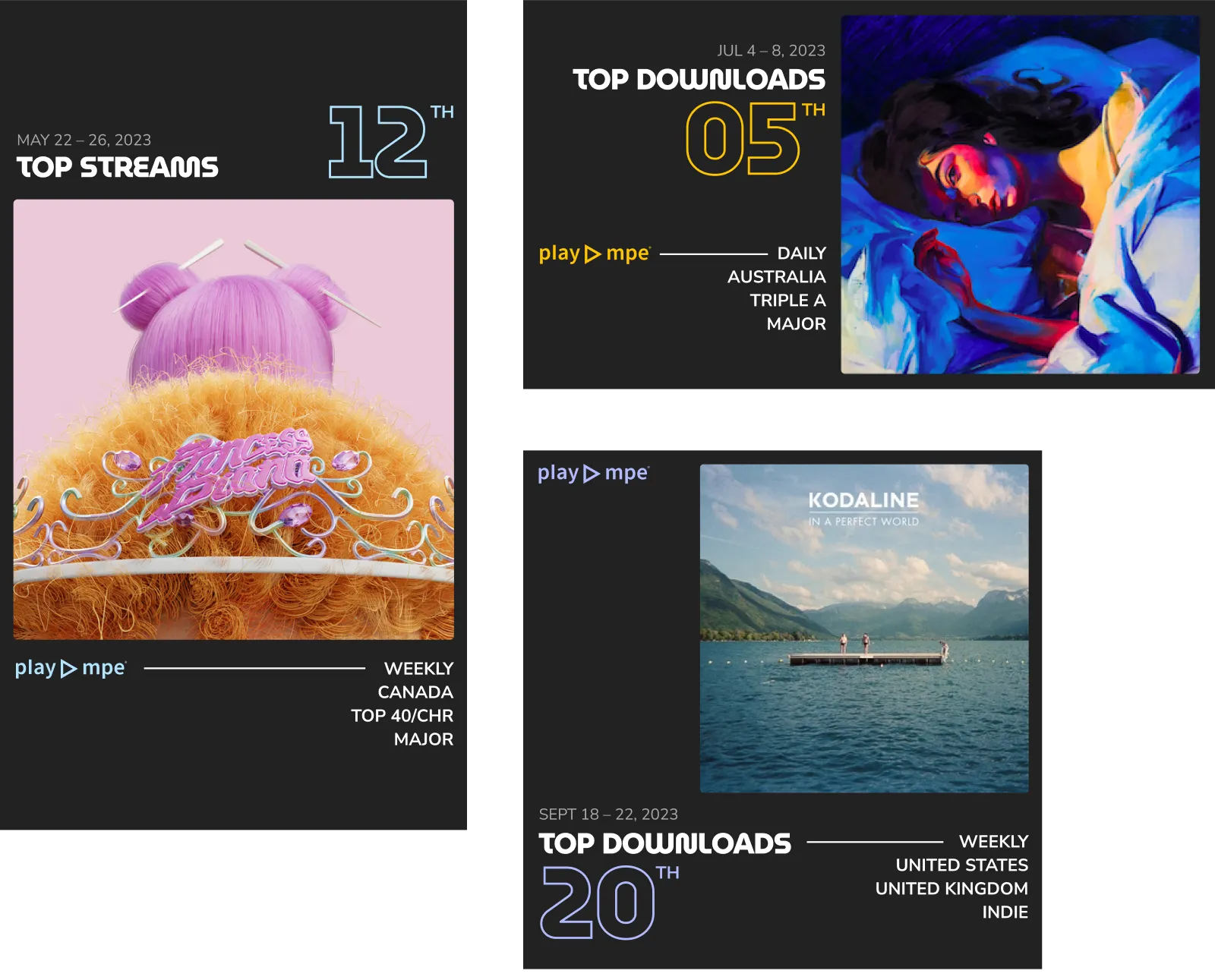
final set of social shares
Delivery
A frustrating struggle with the Contractor
With all the foundational requirements set in motion, it was time to finally bring this project to life. The contender to build out our vision was a Contractor we had used for the main website, who was seen as the best option, as they had the familiarity with the site.
Unfortunately, this Contractor came with multiple warnings and complaints by other managers that had previously worked with them — noting poor quality of work and timelines. The initial website took 1.5 years of development time, in contrast to the contractor's proposal of 6 months.
Although both myself and the Product Manager needed no further warnings to shy away from this contractor, they were still selected for the project regardless.

Knowing people's concerns with this Contractor, I spoke with those who had worked with him, just so I could better prepare for how I could contribute to a better outcome. In the end, this meant giving more support so that the receiving team had extra resources to rely on for clarity.
For the design deliverables, I laid it out similarly to a site map and sectioned the Charts by function. Every frame in Figma was annotated with comments to explain any functionalities and logic — while there was also a dedicated section on general patterns like hovers, active, focus, etc. I broke down all Interactive elements by their states. I also did a recorded walkthrough with Loom to verbally explain the process and annotated tickets.
For the initial kickoff, we did a live-walkthrough. They were given direct access to me via Slack and any requests or further clarifications they had were amended to the designs immediately to prevent being a blocker from development.
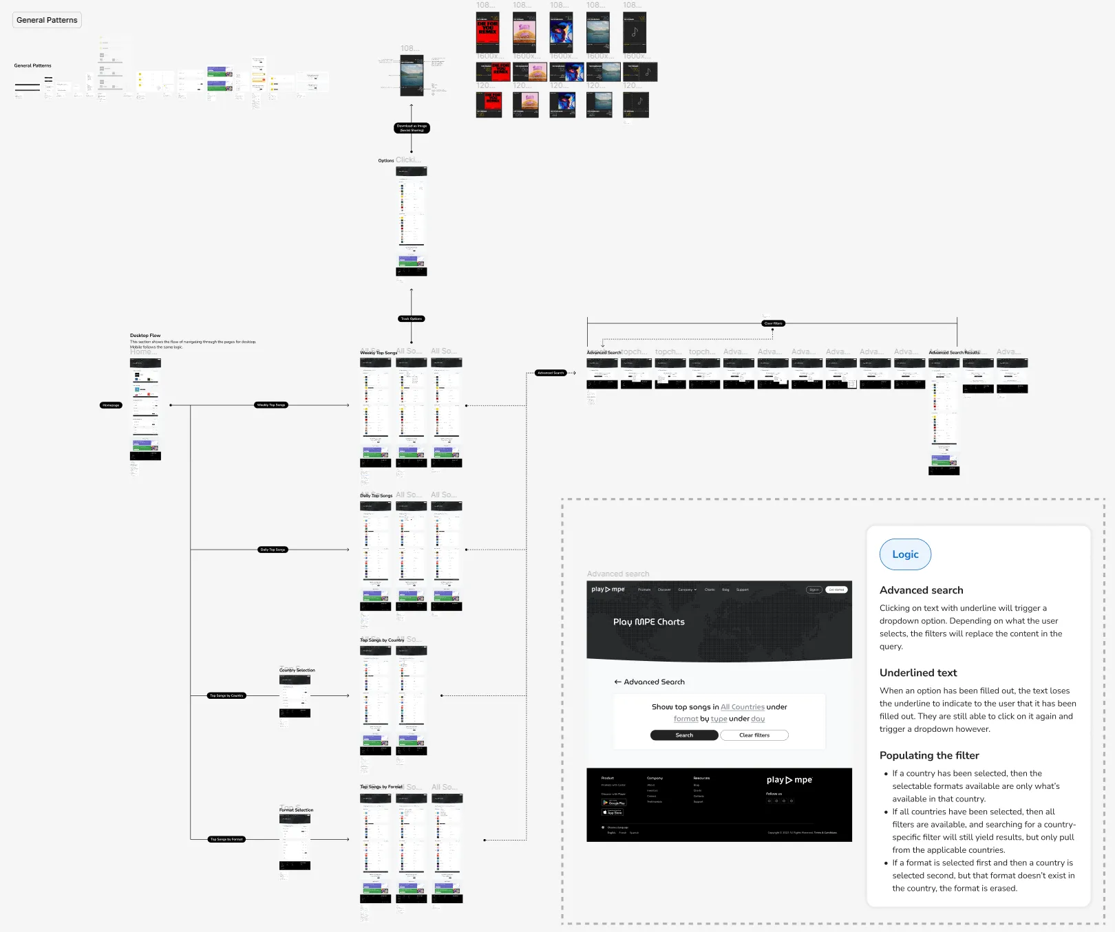
DESKTOP DELIVERABLES and annotation snippet
The Contractor provided periodic updates about the progress and 3 weeks later, we got the message from the contractor saying that the website was completed, quality assured (QA), and ready for reviewhis is where the nightmare beg
There were a total of 13 distinct review sessions that spanned over 3 weeks. Each round was required as previous asks were half-delivered, completely missed, or off-specs to the designs provided. The first review session was the bulkiest, as I had found over 71 issues for Desktop view and 45 issues for Mobile and Responsive views for a total of 126 issues. This was after they had guaranteed the website had been QA'd by their team.
The reviews were documented in a spreadsheet and initially began as text descriptions paired with a screenshot highlighting the problem, while linking back to the original designs. Eventually, it evolved to the point where for each issue I reported, I needed to create a Before & After - what they did vs. what the designs show. At times I even included my HTML/CSS I did via Google's DevTools to give them the specific values they needed to input to match the design blueprints because the Before & Afters were not enough.
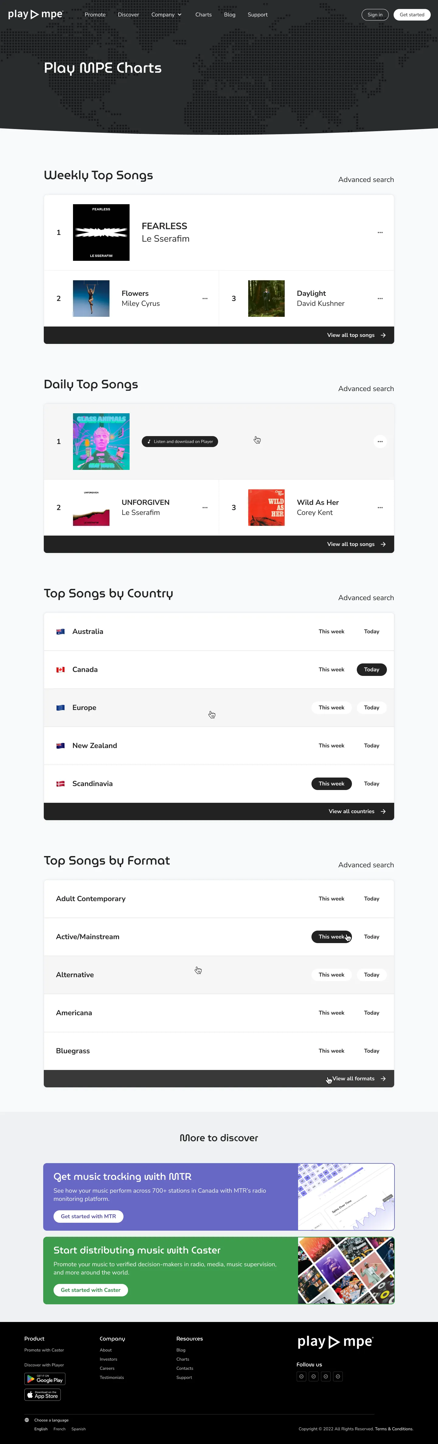
Below is a screencap of what the Contractors provided (1st image) in comparison to the designs that I provided to them (2nd image). This was their 4th iteration or so, after having received prior feedback.
There were a total of 13 distinct review sessions that spanned over 3 weeks. Each round was required as previous asks were half-delivered, completely missed, or off-specs to the designs provided. The first review session was the bulkiest, as I had found over 71 issues for Desktop view and 45 issues for Mobile and Responsive views for a total of 126 issues. This was after they had guaranteed the website had been QA'd by their team.
The reviews were documented in a spreadsheet and initially began as text descriptions paired with a screenshot highlighting the problem, while linking back to the original designs. Eventually, it evolved to the point where for each issue I reported, I needed to create a Before & After - what they did vs. what the designs show. At times I even included my HTML/CSS I did via Google's DevTools to give them the specific values they needed to input to match the design blueprints because the Before & Afters were not enough.
Below is a screencap of what the Contractors provided (1st image) in comparison to the designs that I provided to them (2nd image). This was their 4th iteration or so, after having received prior feedback.
contractor's deliverable
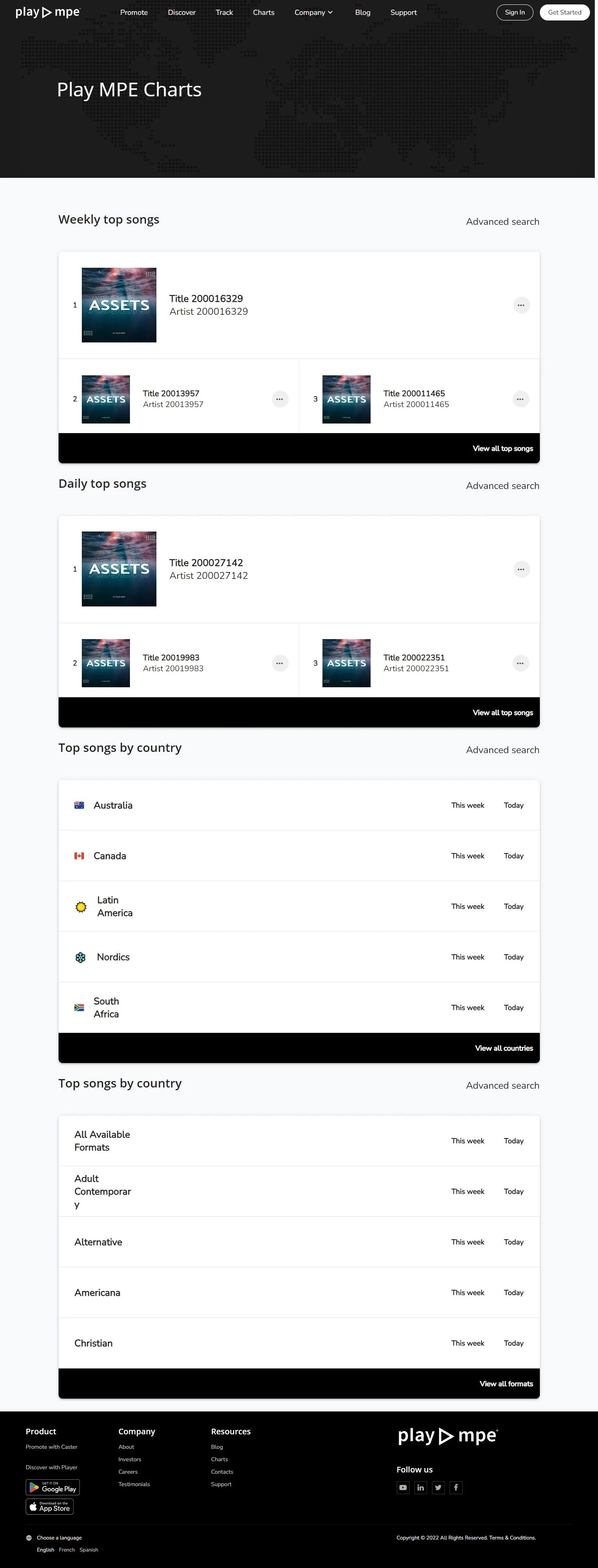
original designs
Of course, there are acceptable differences between any static design to dynamic build, but the discrepancies here were not minor or something that can be swept under the rug. There were missing/inaccurate fonts, misalignment of content, inaccurate paddings and margins and colors. Not to mention - the "More to discover" section was entirely missing. I don't think I could ever accurately explain my live reaction, but for any caliber of paid professional work, this just wasn't (and still isn't) acceptable to me.
Fun fact: The live version still has a bunch of unresolved issues.
This stage was particularly frustrating for me as no matter which communication method I used, most things were implemented halfway and required multiple asks. Yet, there were no concerns about how I was relaying the information - the Contractor would always note that my instructions and asks were clear. Although we had suspicions previously, it was discovered at this time that the Contractor was contracting the work to other people...

Moreover, I was the only one who conducted QA as other members had delegated the task to me, so realistically, I alone can only find so many bugs. Part of the reason why there were 13 rounds of revision was also because changes that were resolved would become a problem again, almost as if it had reverted, resulting in a lot of tail chasing. This required me to keep a strict list of all the changes that have been asked for and completed.
After the bulk of the Charts was completed, it took an additional month between myself, the Product Manager, the Backend Developer and the Contractor to implement share to socials. These were to be created in HTML/CSS by the Contractor.
Initially, this went through 3 rounds of revision, until I realized that the Contractor had been sending us zipped files of the HTML/CSS. I decided to make the changes myself because we was getting nowhere with the constant back and forth.
Below is an example of the Before and After's I sent to the Contractor. Although I understand that this falls into pixel-perfection territory, I think there needs to be a respected agreement to what was promised. In this context, I don't think it was farfetched to ask for that - especially considering there were multiple issues, as opposed to one.
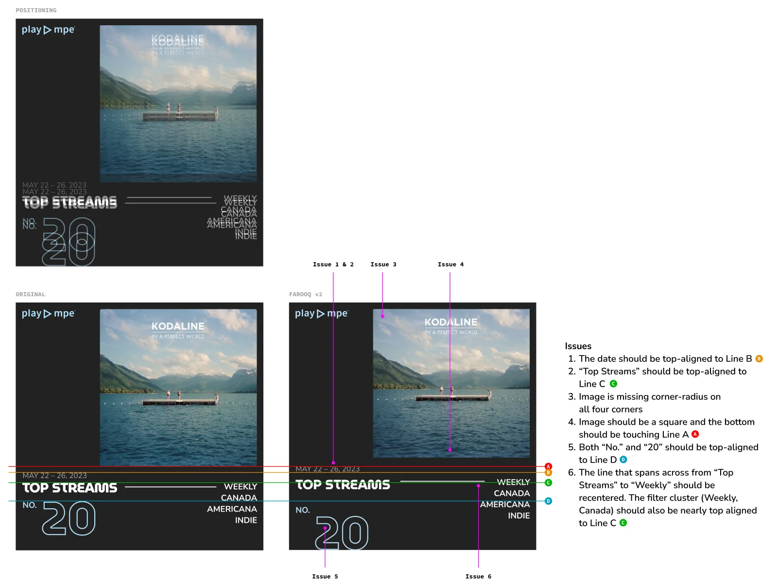
contractor's deliverable vs. original designs
After all the QAing, there was approximately still a month that followed where the Charts became technical battleground between the Contractor and our Backend Developer trying to implement sharing compatibility to social media platforms. For Marketing, this resulted in a soft launch as there were constantly issues that created a lot of uncertainty about the finality of the Charts. Of course, all these events were unsurprising, as we had been warned from the beginning.
results
The finish line was more unfinished business
Although the journey getting the Charts launched was rough, the end results were equally rough. This project doesn't come with a happy ending, at least... not fully.
There was an assumption that because the Charts would be launched on the same domain as our website, Google Analytics would be integrated as well. The Contractor considered this an additional package, which was never negotiated for. The addition of this would be an extra, but Play MPE didn't provide a budget for this, so the Charts never got Google Analytics. You might be thinking, "Just add it in yourselves!" and you would be right, except the Play MPE team doesn't have access to the website. Appropriately — LOL.
It's okay, you can laugh. I definitely did.

Social media sharing was also restricted to just Twitter and Facebook, as those were the only APIs that allowed sharing from a web. Most social sharing requires the origin to be from an app. As a compromise, we made the social shareables as downloadable JPGs in different dimensions. Across social media, we've seen more than a dozen artists share their accolades with their fans.
In general, we also saw an uptick with users subscribing to receive the Daily or Weekly Charts in their inbox. This feature was previously manual, only made known to select users and required the Support team to enroll people, so it was fantastic to see people enrolling and becoming aware of Play MPE Charts.
In general, we also saw an uptick with users subscribing to receive the Daily or Weekly Charts in their inbox. This feature was previously manual, only made known to select users and required the Support team to enroll people, so it was fantastic to see people enrolling and becoming aware of Play MPE Charts.
Reflections
Red flags are red for a reason
This project began as a fun challenge. The need to create a navigation that accommodated for the expansion of limited regions and formats to a multitude of options, including new time-scales such as Daily and Weekly Charts, lent its way to a creative solution that used a combination-search to simplify the options available to users.
As well, it was a game of Jenga to balance an identity that still meshed with the main site, but avoided the bits that were not well received. Sadly, the fun of the project was mostly overshadowed by the deliverable and quality control nightmares.
While this has been an aspect that I've enjoyed previously, this experience solidified my passion for bug-finding and doing QA. I had a blast going through the documentation and matching what was created and what was asked! I also enjoyed the parts where I tried to break the website and the explorations in different viewpoints to find any weirdness.
I pride myself in being a meticulous communicator and this exercise allowed me to do that. Initially, some doubts did arise as to whether my asks were unclear, given that my asks had to be conducted multiple times before the results were even remotely met. But this doubt was eased when I verified my asks with people who were both involved and non-involved, where they validated my reporting and were able to repeat back to me my requests and desired outcomes.
If anything, my resolve was tested, as there were times where other people's mentality defaulted to convincing our team to accept less than acceptable work. But, we still pushed through to get as close to what we asked, even if it wasn't everything we wanted in the end. To me, that is standing by principle (and what we paid for too!)
Although the Charts have launched and our artists will find joy in the new aesthetic and functionalities of being able to showcase the wins, they'll mostly be oblivious to the storm and fury that waged behind the scenes.
© jeffrey chan, 2026.