PLAY MPE
Evolving Caster
Caster is a music distribution platform that helps artists send their new singles and album releases to radio and music spaces.
Role
Sole Designer for all Caster needs. Conducted user and stakeholder interviews for criteria on overhauling existing features and design new ones. Delivered high-fidelity prototypes to Developers while guiding their build.
Team
Myself (Sole Designer), 1 Product Manager (subbed in by Director of Product for first 4 months), 5 Developers, 1 Quality Assurer.
TIMELINE
Eight months (specific to self-service revamp).
Overview
Caster is the primary product at Play MPE where artists and labels can utilize a vast network of radio and media recipients to distribute new music to. These releases are sent to industry-vetted clients, giving radio-people access to the latest music put out by artists and labels. The platform is exclusive to industry professionals and come with options for Self-service (DIY) or Full-service (professional handoff) for releases.
The Caster team consists of a Product Manager, 3 Frontend Developers, 2 Backend Developer, a Quality Assurance (QA) Engineer, and myself as the sole Product Designer.
The Caster product is burdened with several issues. Until October 2023, no singular flow from start to finish within the product was designed with the same aesthetic. Each action could prompt a workflow that is visually and logically different.
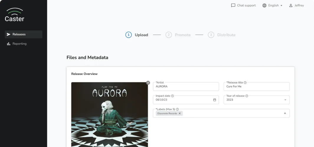
full-service Caster: create release
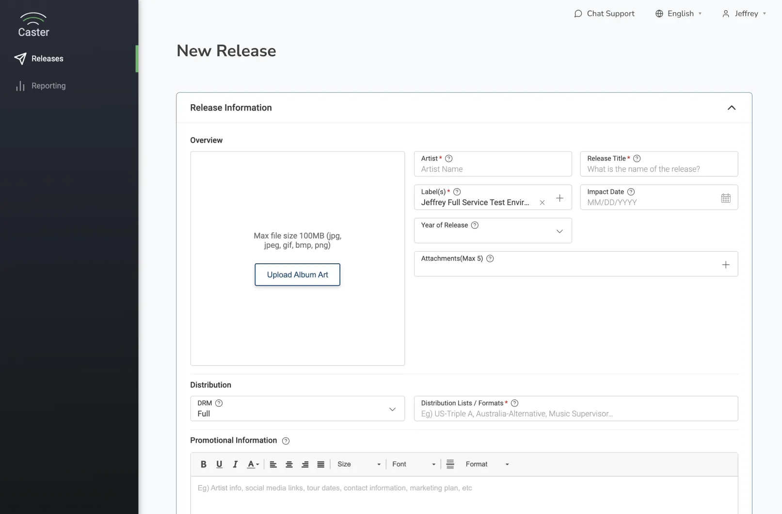
Self-service Caster: Create release
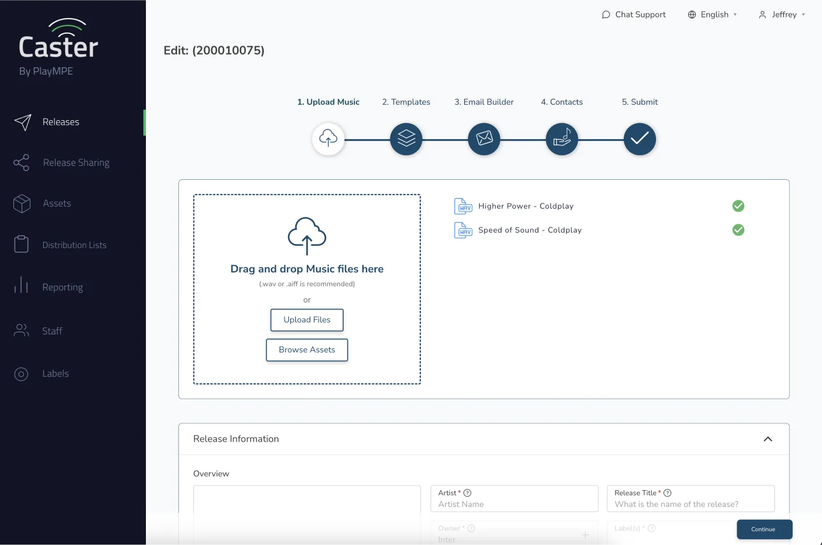
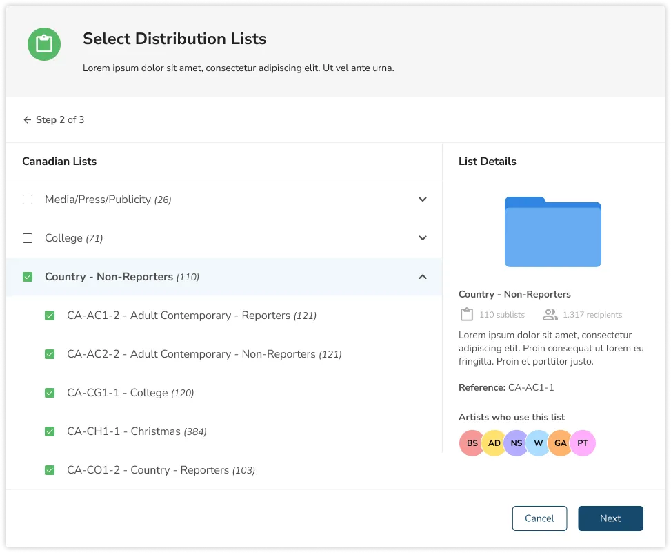
Self-service Caster: Step 4
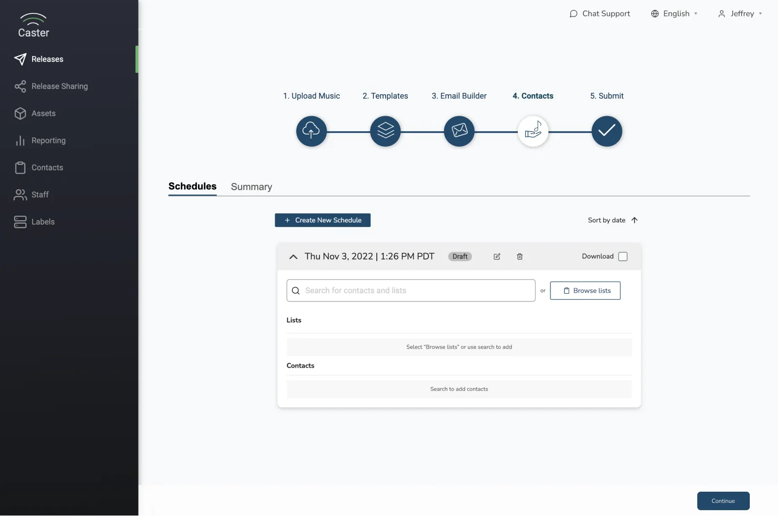
SELF-service Caster: step 4 modal
For example, the Self-service screenshots are all from the same workflow, but the sidebar changes design depending on what step you're on. It also differs from the design of the Full-service one (ignoring the navigation options). If you look closer, you'll also find that the detailing is also different between Step 1 and Step 4, where the former employs a flat design, while the latter uses gradient and shadows for elevation.
Although these are minor details, the severity changes throughout the entire platform and the discrepancies pile up quickly, especially when the violations creep into the territory of changing workflow.
Although these are minor details, the severity changes throughout the entire platform and the discrepancies pile up quickly, especially when the violations creep into the territory of changing workflow.
Second, the base code is written in a language (Angular) that has been sunset and a rewrite into a modern language (React) was estimated to take 2.5 years for completion. This was assuming no new features or improvements were implemented to the existing product. The language disparity often created road blocks for new features due to the communication limitations between Angular and React.
Thirdly, new feature priorities were often tailored to the largest client, Universal Music Group (UMG). These were not useful to clients outside of UMG and were quite alienating to repeatedly receive feature updates that were not relevant.
In my time with the Caster team, we shipped 8 new features (read: entire reworks) with an estimated 2 month development time for each project, most of which were targeted to the general audience! The most important multi-phase feature to date was the development of the self-checkout process for music distribution, allowing clients to navigate through the platform entirely by themselves.
PRECEDENCE
Caster workflows required clients to be co-dependent on the internal team
When a client used Caster, their objective was to assemble and prepare their music in a format that was targeted to specific radio and industry people. Each client would require the help of the BusDev team to tailor a distribution plan for their release, which the Operations team would then build out those requests and specifications for distribution. This created a lot of manual labor for internal teams and a highly dependent relationship on the client's side in order to get a release fully distributed.
On average, the BusDev team spent 1-2 hours strategizing with clients (sprinkled with impromptu calls), while Ops would use up to 1 hour for assembly, invoicing, and outreach. The total manpower for a single release could be upward to 3 hours between client and the internal team.
Given the heavy labor, we prioritized implementing an autonomous self-checkout to provide clients the tools and education to complete a release by themselves, while also supporting business scalability.
Redefining manual processes for distribution
For an artist to have the best chance of their music gaining air play, they needed to be strategic about selecting recipients that are aligned with their music's region and format. These recipients were radio stations or music executives that focus on broadcasting or promoting specific format of music, such as Alternative, Hot AC, Triple A, etc. Play MPE acts as the middle-person that compiles these radio stations and music executives into a package, so clients can distribute directly to them.
In the current iteration, clients would have to manually search the package offerings on an external PDF, and then type it into a text field. This often created issues for the Ops team if clients lacked specificity about their selections (region, name, or subgroup). Clarity on this matter was important as the intended selection could affect invoicing totals.
Imagine going online shopping and having to type the exact name of the item you want into a text field. Simply typing "Top" is not enough. Is it a button-up, a t-shirt, a sweater? In this scenario, you also don't receive your total until you submit your order and get your bill back. If you want the total prior, you have to do manual math. This is how the system worked for clients selecting distribution packages – there was a need for manually typed ultra-specificity.
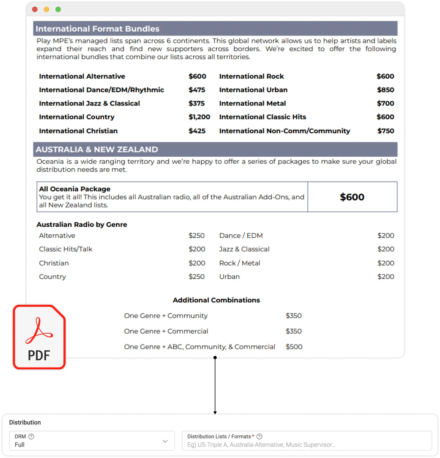
Pricing guide and the text field for distribution choices
Another issue with referencing an external PDF was that the document did not explain what the package contained. The name was as far as the clue went. For clients new and old, they lacked insight on understanding what package was best for them. If they were sending to AC (Adult Contemporary), would Hot AC or plain AC be the better choice? There was no explanation of the differences.
Going back to the shopping analogy, imagine selecting "Top" but it shows no indication of size, cut, length, or material. I'd be hesitant to spend money on something where the outcome is ambiguous. But that's exactly the issues clients faced when selecting formats for distribution.
If not for these troubles, there was also the issue of users needing to reference a document off-platform to complete their Caster objectives. These obstacles made the distribution process incredibly hand-holdy and prone to billing and communication errors. Clients were not empowered to navigate through the platform by themselves. This was what I was tasked to improve upon.
Product validation
Automating manual processes and removing guesswork
To bring forth the implementation of self-checkout, these were the changes required for the current iteration of Caster:
- Convert the text field into an interactive menu that allows users to select the packages they want to distribute their music to.
- Provide education and detailed knowledge about the target recipients of each package offered to the client, so they understand how it benefits them.
- Reduce the time required by the Business Development team to coach clients on what lists they should be selecting.
- Remove the need for the Operations team to manually create an invoice based on the client's selection of lists.
- Provide real-time pricing of package selections and an inventory so the clients do not have to manually calculate their prices on their own.
The theme of these changes were to educate and empower our clients so they understood the impact of what they were doing with real-time feedback, while easing their reliance on the Internal team for help that could otherwise be provided on the platform.
The project was split into three separate phases in order to roll out the needed changes to completion - allowing us to be reasonable with the asks of each phase while limiting scope creep.
Phase 1 would transform the text input field into an interactive modal, so clients no longer had to manually input their distribution selections. Phase 2 would split the Release Creator into 3-steps to align closer to conventional eCommerce patterns. Lastly, Phase 3 would introduce a Summary page, while Phase 4 finalized the entire project by bringing payments into the fold for a complete checkout process.
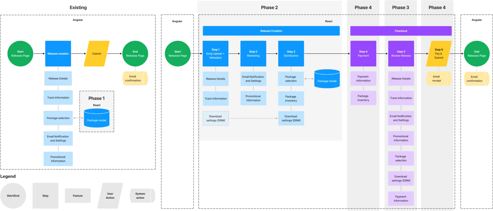
phases for self-checkout
problem space
What can we do to implement educational and self-supporting features to alleviate co-dependency between clients and internal departments?
PHASE 1
Designing the Distribution Lists Modal
Distribution Lists (internally, Packages) were the most essential piece to this project, as that was the main thing clients interacted with. To ensure that we properly empowered clients to feel confident in making the right selections for their music distribution, we needed to focus on product clarity and how it was relevant to their releases.
Based on discussions with various Caster users, the Business Development and Operations department, we discovered recurring themes as noted below. The sentiments were close to what had been echoed about selecting packages. In our findings, there was a lack of understanding for what the client was paying for, which hindered their ability to make their own decisions or even explore different configurations, especially when decision-making often hinged on the support of Internal teams at times.
Based on discussions with various Caster users, the Business Development and Operations department, we discovered recurring themes as noted below. The sentiments were close to what had been echoed about selecting packages. In our findings, there was a lack of understanding for what the client was paying for, which hindered their ability to make their own decisions or even explore different configurations, especially when decision-making often hinged on the support of Internal teams at times.
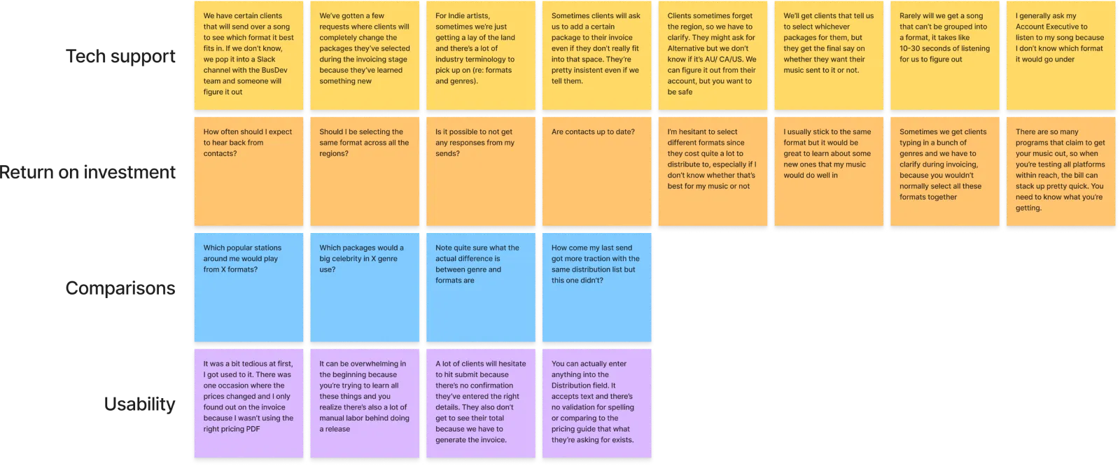
research notes from client and internal STAFF
As the Design System was up and growing, certain patterns were readily available for me to pick apart and play with. A direction my Director urged me to explore was the use of visual elements and color as an opportunity to bring life to the platform. For a music platform, Caster was pretty drab and lacking visuals. As these qualities did not have a strong presence in any of the components that had been previously designed, I pulled what existed in the Design System and took some liberties to introduce potential new patterns.
Below were some of my explorations for what the Distribution modal could look like. I experimented with a inspirations from Apple's iOS File Explorer, Proportional Area charts and an interactive map.
Below were some of my explorations for what the Distribution modal could look like. I experimented with a inspirations from Apple's iOS File Explorer, Proportional Area charts and an interactive map.
Exploration 1
Exploration 2
Exploration 3
Exploration 4
Exploration 5
Exploration 6
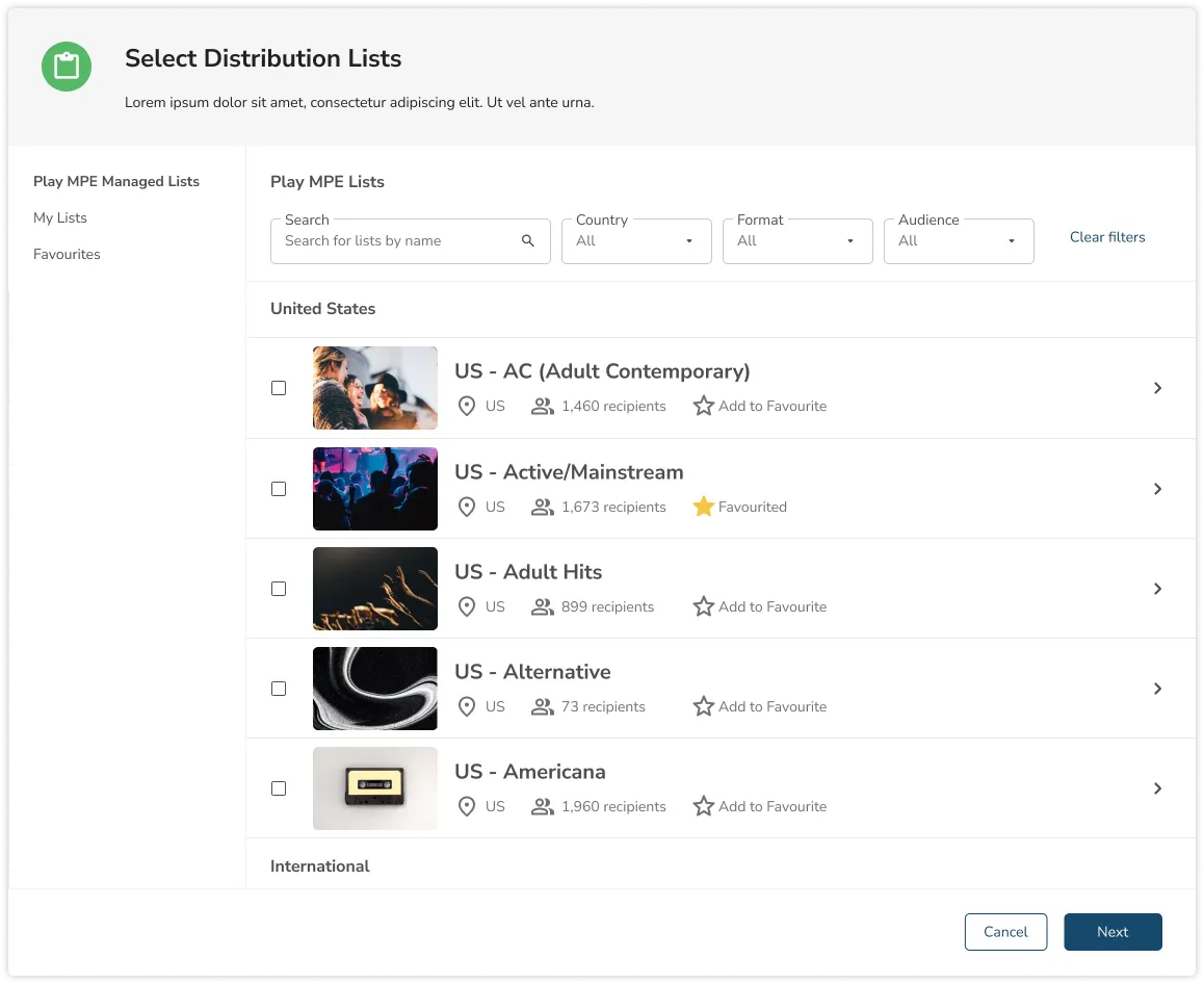
Of the numerous designs I had prototyped, Explorations 5 and 6 were the strongest contenders and played together as a set. In '5', the search and filter options allow for seasoned clients to quickly find what they wanted, especially if they're going to retain the behavior of typing in their preferences. At the same time, the scrolling component gives way for discovery. It also makes for a more interesting experience to see the visual aspect of each package, as opposed to just a wall of text.
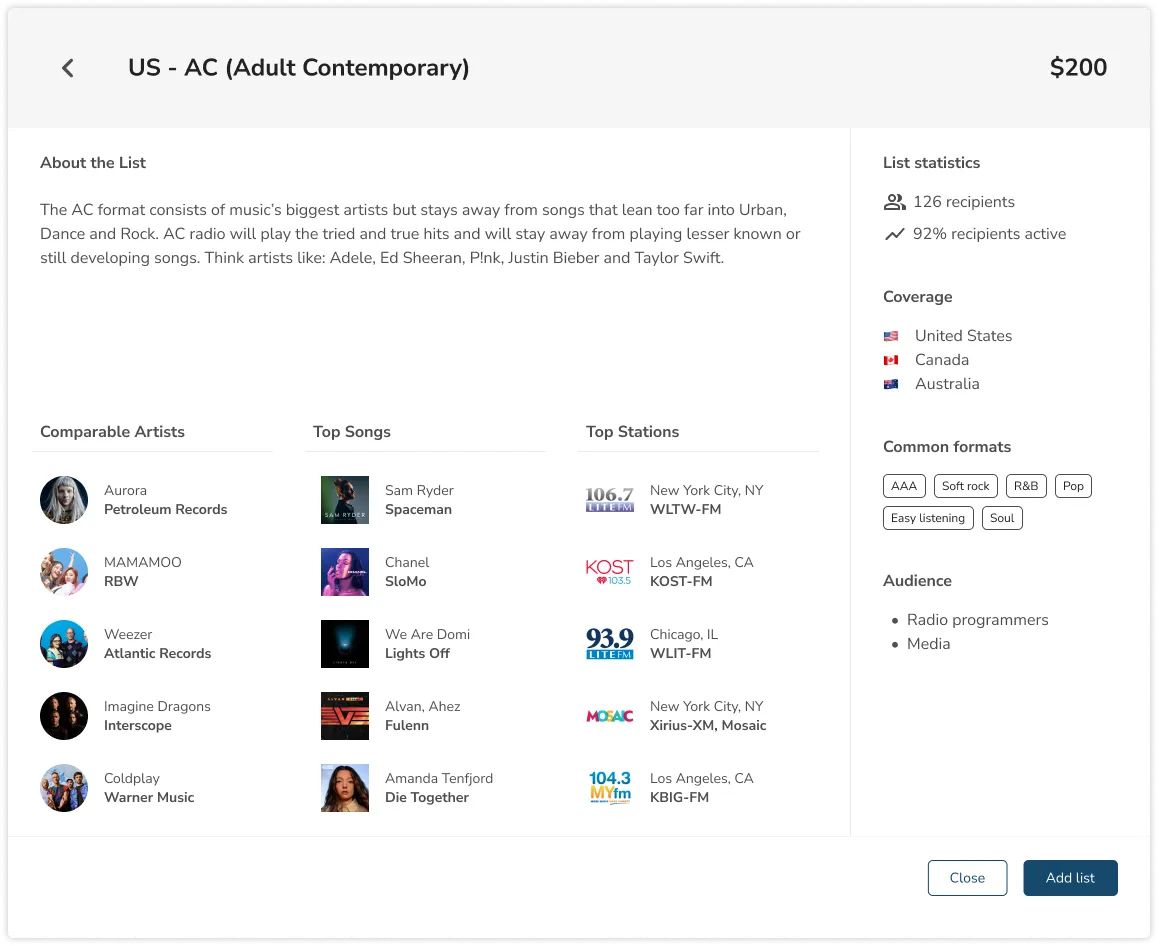
Moving into '6', for those who need a deeper understanding of what the Distribution List offers, this provides an overview of the value they could receive. The modal introduces the package with a description, while introducing a table that shows Comparable Artists, Top songs that are distributed under this list, and Top Radio Station recipients.
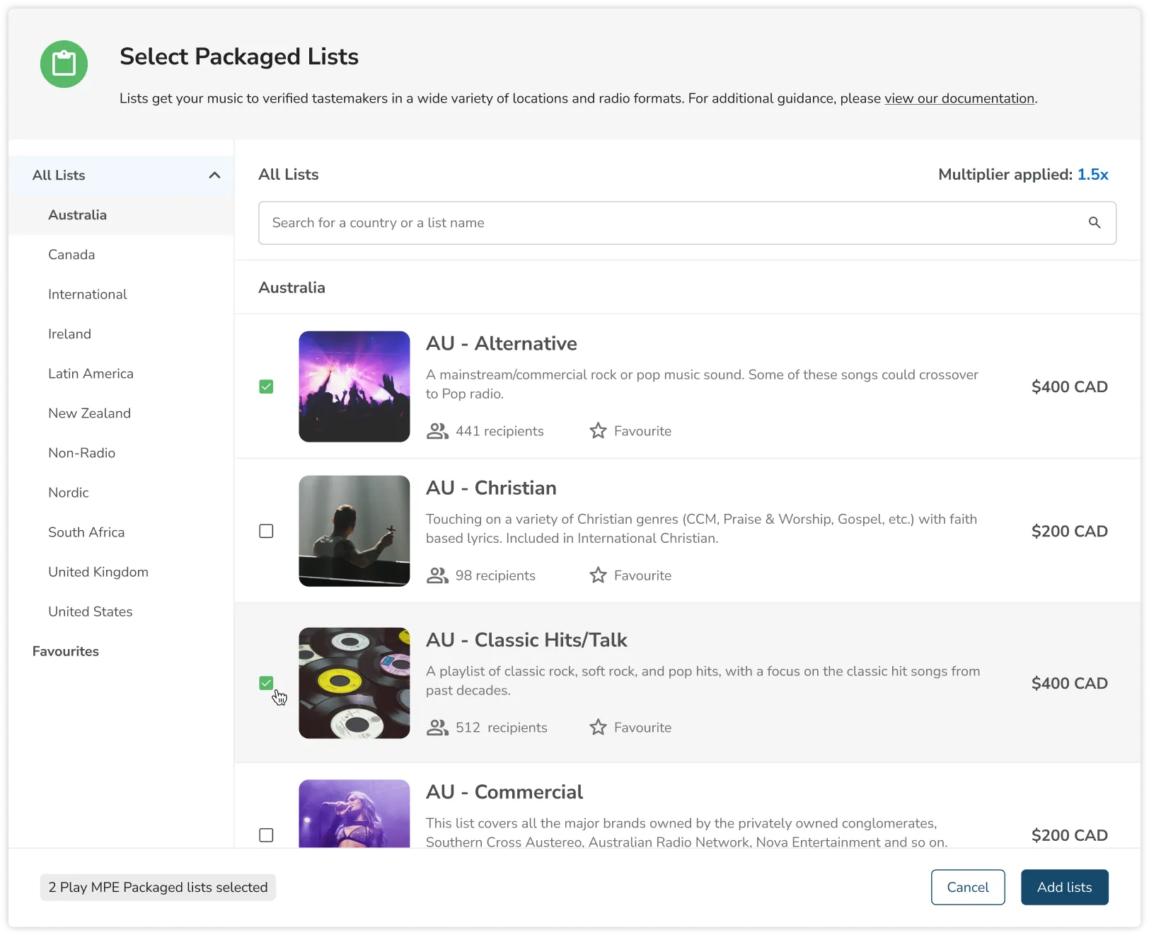
We pitched this back to clients and the internal staff and all parties were quite happy, but long story short, this project went on pause because of a company restructure. When this was picked up again, we had to slash a bunch of features due to new management vision. Oh yeah, the name also changed again to Packaged List.
The naming was actually a headache, because this thing was known to different people as Distro, Distribution List, Play MPE Managed List, Packaged List, Recipient List... the names go on. Agreeing on a single name was a whole task.
Anyway, below was what we actually implemented into the live product. Keep in mind, there's a little bit of time-skipping here because Pricing was introduced much later. The first version of the modal below didn't include prices.
Moving into '6', for those who need a deeper understanding of what the Distribution List offers, this provides an overview of the value they could receive. The modal introduces the package with a description, while introducing a table that shows Comparable Artists, Top songs that are distributed under this list, and Top Radio Station recipients.
We pitched this back to clients and the internal staff and all parties were quite happy, but long story short, this project went on pause because of a company restructure. When this was picked up again, we had to slash a bunch of features due to new management vision. Oh yeah, the name also changed again to Packaged List.
The naming was actually a headache, because this thing was known to different people as Distro, Distribution List, Play MPE Managed List, Packaged List, Recipient List... the names go on. Agreeing on a single name was a whole task.
Anyway, below was what we actually implemented into the live product. Keep in mind, there's a little bit of time-skipping here because Pricing was introduced much later. The first version of the modal below didn't include prices.
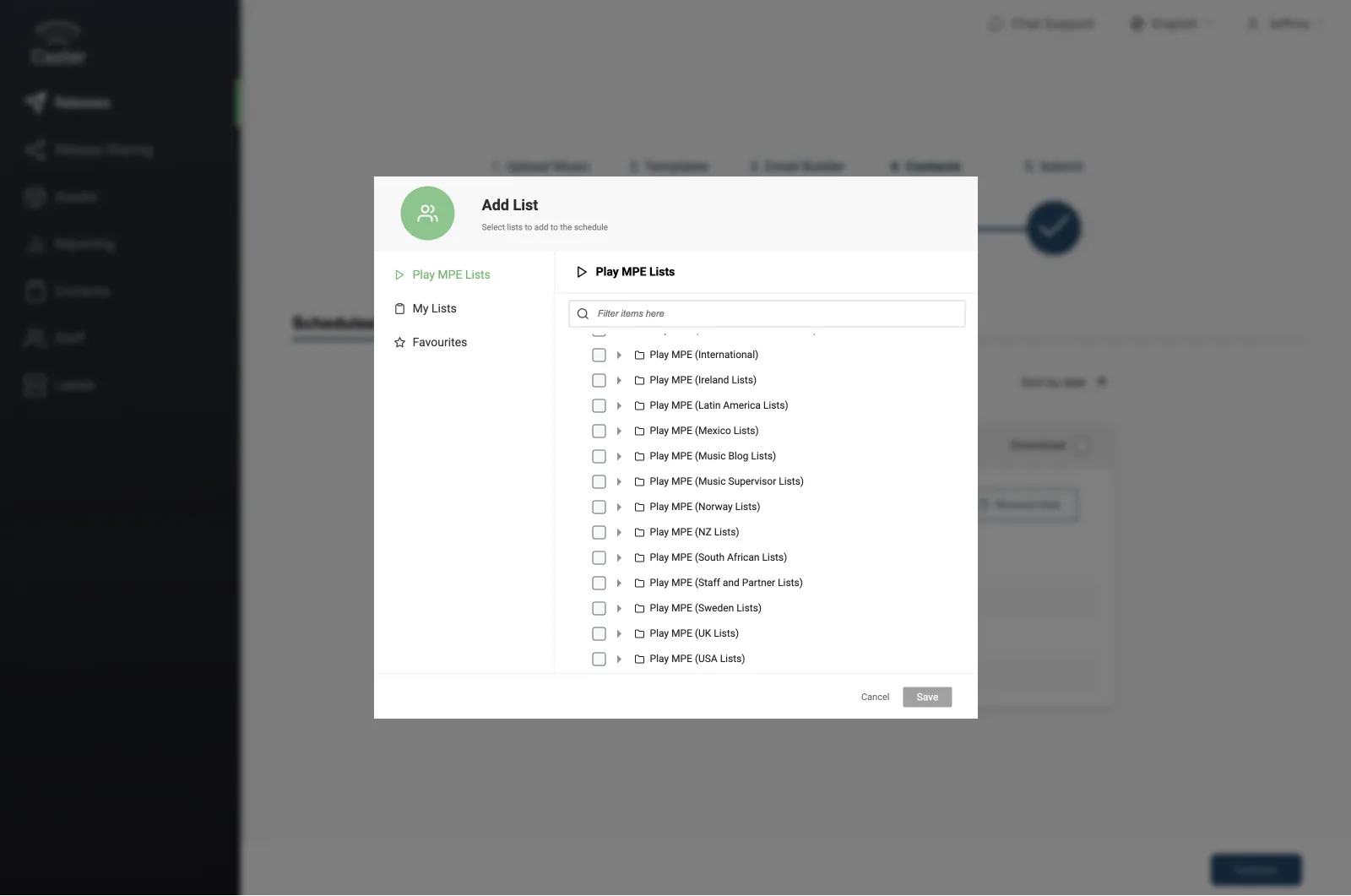
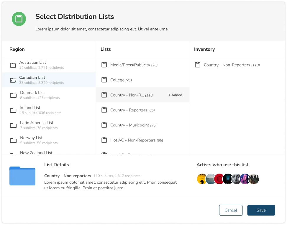
final packaged list modal
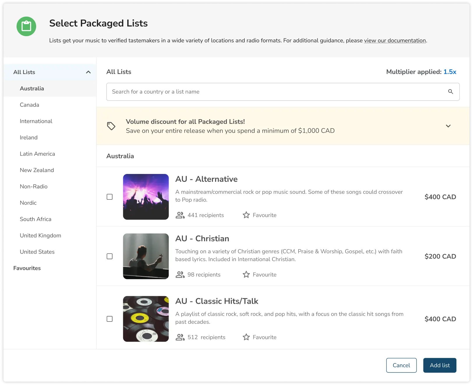
packaged list: banner
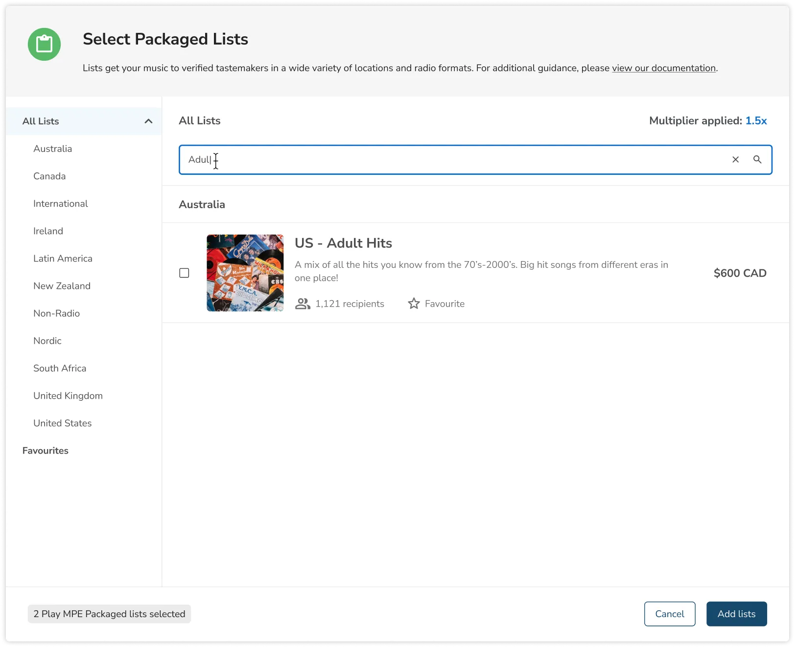
packaged list: search
As you can see, the overview with the detailed tables have been slashed. Although education took a toll, we were still able to provide a snippet of what clients could expect from the package. Clients now had a physically tangible object when they're browsing through packages and no longer relied on a PDF that may be out of date.
The biggest battle for implementing pricing lied with dynamic data. Because we offer prices in multiple currencies and selection choices could become bundled deals, the Developers had a serious field day trying to muster working logic.
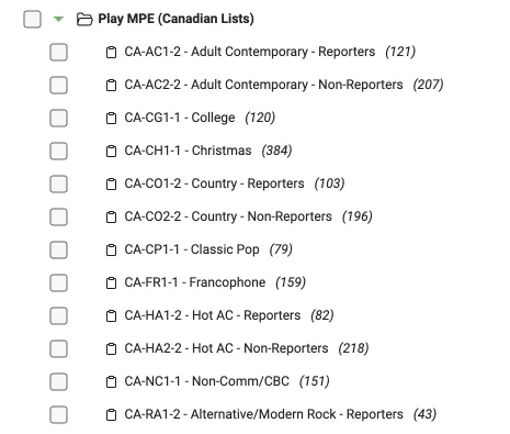
Even though it's not visible, this design also allowed for the backend to declutter and was a necessary step to free up the bandwidth for the road to self-checkout. For instance, we were able to hide internal user codes that were visible to clients, which allowed us to name the packages as you see above. Otherwise, the names would've continued to look like this (which for many years was actually what clients saw but had zero need for):
The biggest battle for implementing pricing lied with dynamic data. Because we offer prices in multiple currencies and selection choices could become bundled deals, the Developers had a serious field day trying to muster working logic.
Even though it's not visible, this design also allowed for the backend to declutter and was a necessary step to free up the bandwidth for the road to self-checkout. For instance, we were able to hide internal user codes that were visible to clients, which allowed us to name the packages as you see above. Otherwise, the names would've continued to look like this (which for many years was actually what clients saw but had zero need for):
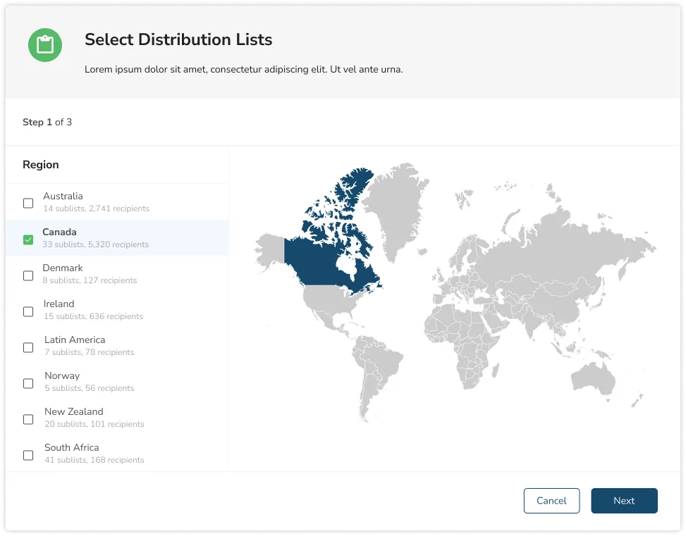
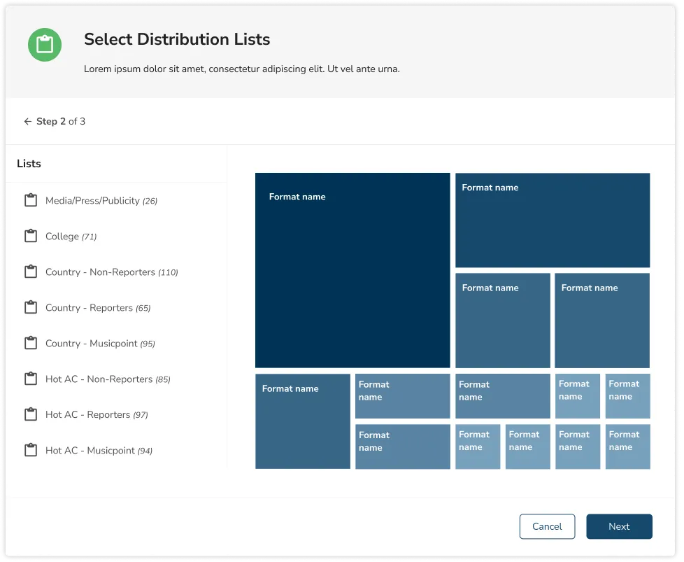
Phase 2
The new Release Creator and the Inventory
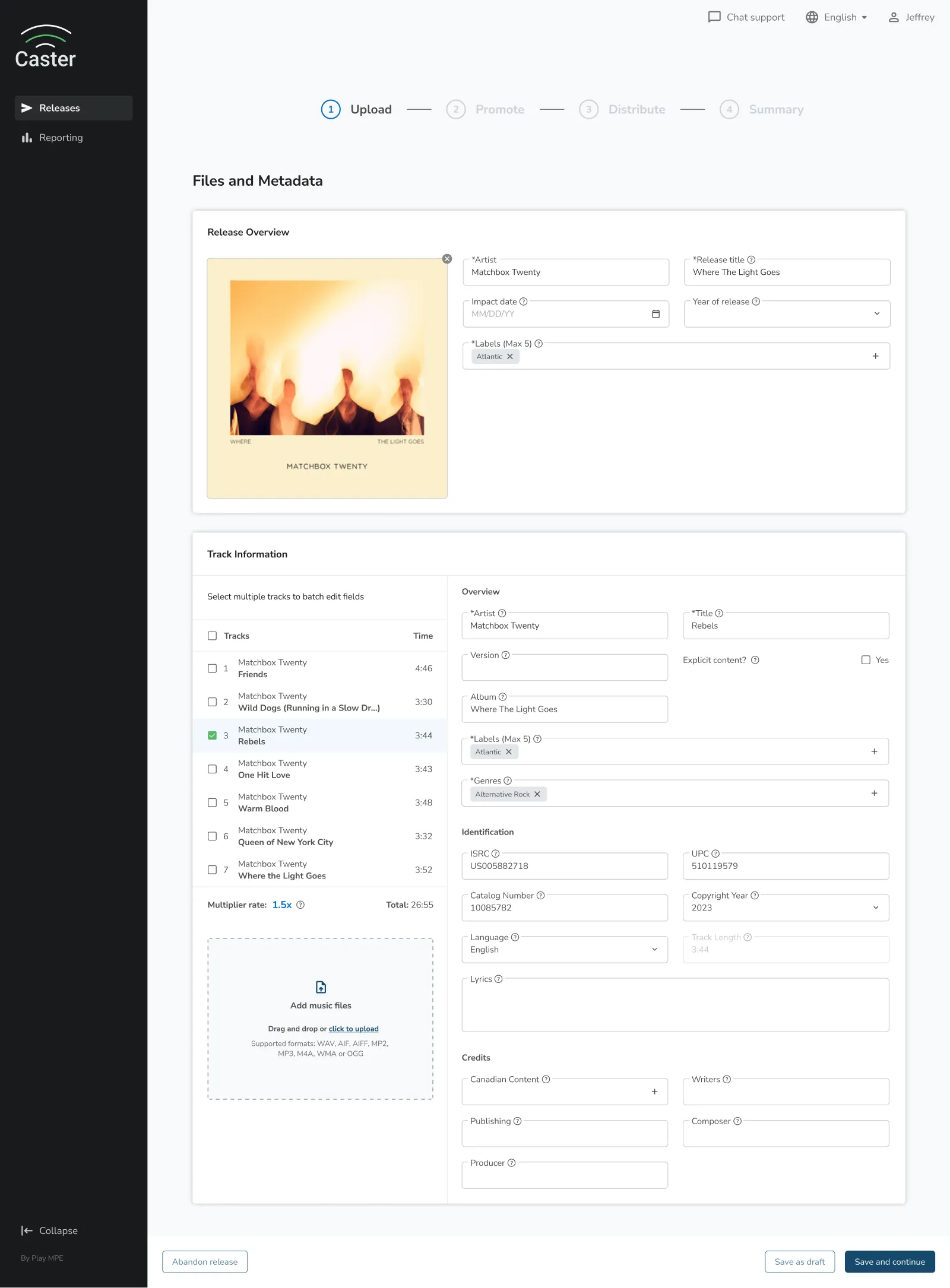
By Phase 2, the Design System was relatively established and rebuilding the Release Creator with up-to-date patterns took essentially no time. I think the actual prototyping time was about 2 hours. If anything, it was the lead-up to design that took the longest as that often triggered conversations about the user flow and task chronology.
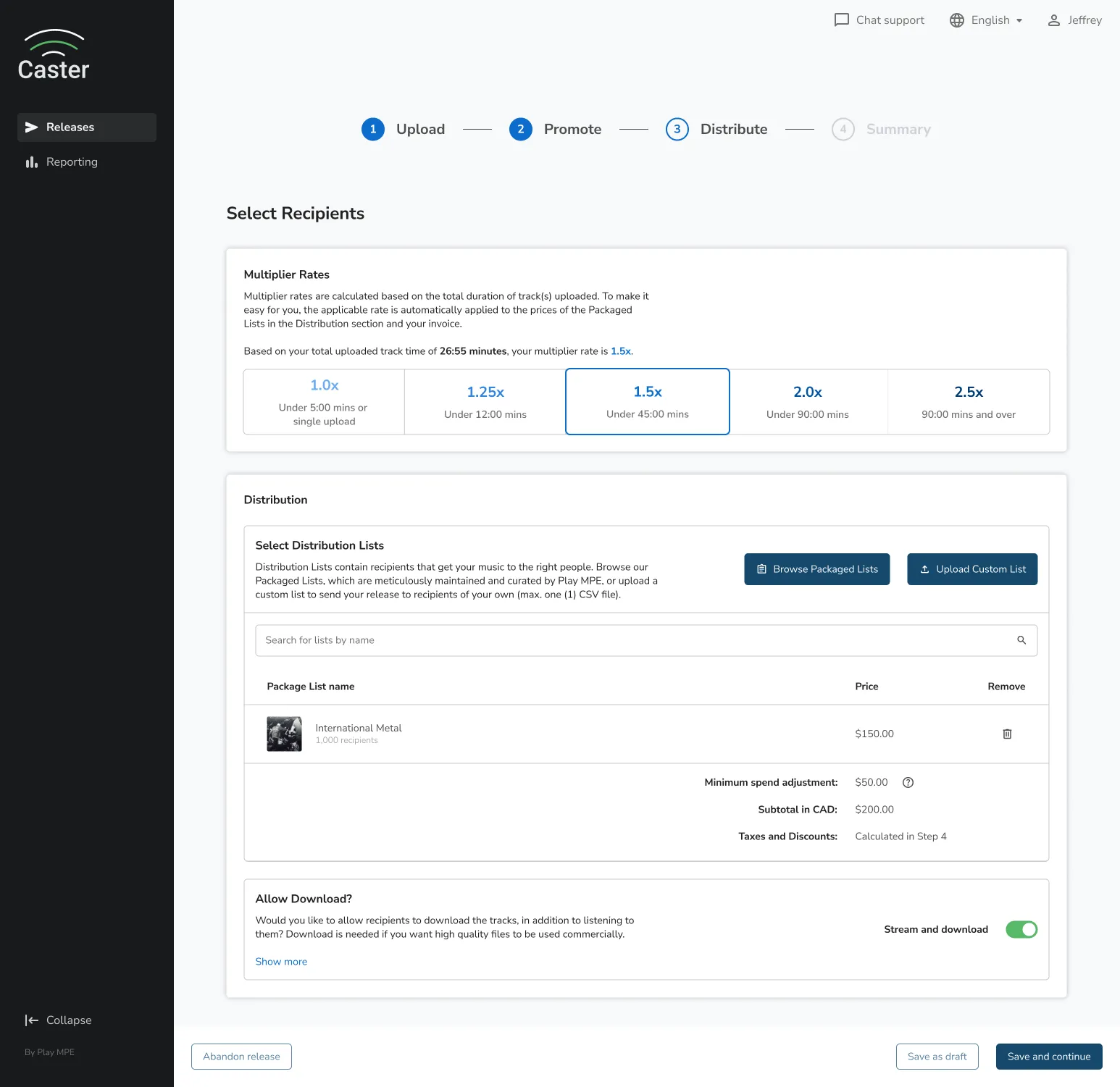
CASTER step 3: distribute
Although you'll see some new concepts, this whole page (and the Packaged List modal in Phase 1) essentially spawned as a reality from the single text field that users once had to type in their distribution selections.
The most important thing on this page was the refactor from Angular to React giving us the luxury of allowing for different parts of the page or step to communicate with each other, thus bringing in the technology of real-time feedback. Prior to this, we weren't able to have pricing or instantaneous selection of packages.
Also kind of sad, but the 'Save as draft' button to the bottom left was the most highly requested feature for over 3 years. The only reason why we were able to deliver was because of the refactor. Within the first week of launching, the feature was used a total of 423 times!
You can also find Caster's Step 1 and Step 2 down below.
caster step 1: promote
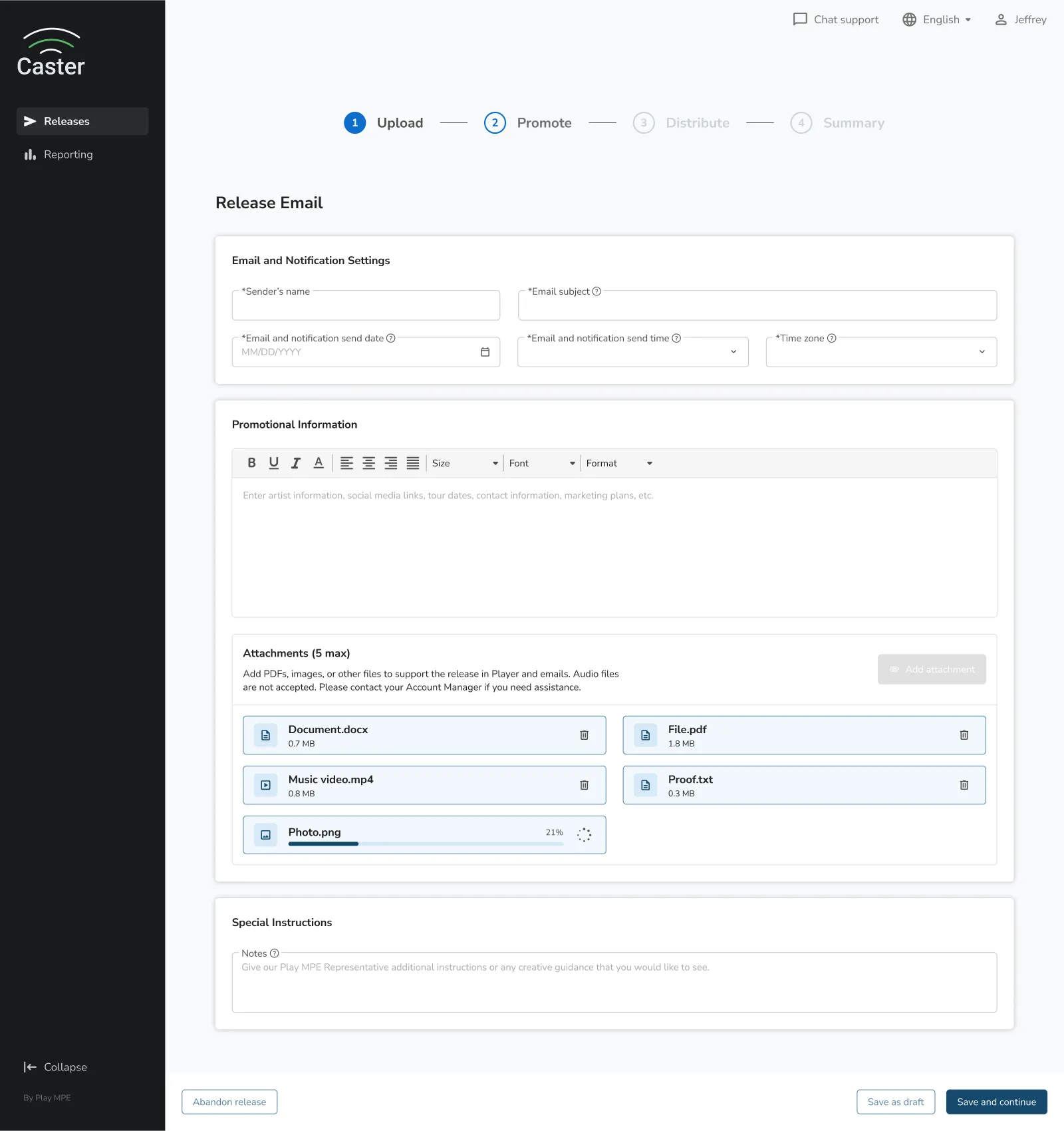
caster step 2: promote
Phase 3
Summarizing the Release Creator
Although the goal was self-checkout, Step 4 was only one step behind from that dream being fully realized. This summary page provides an overview of all the choices that a user has made throughout their release creation.
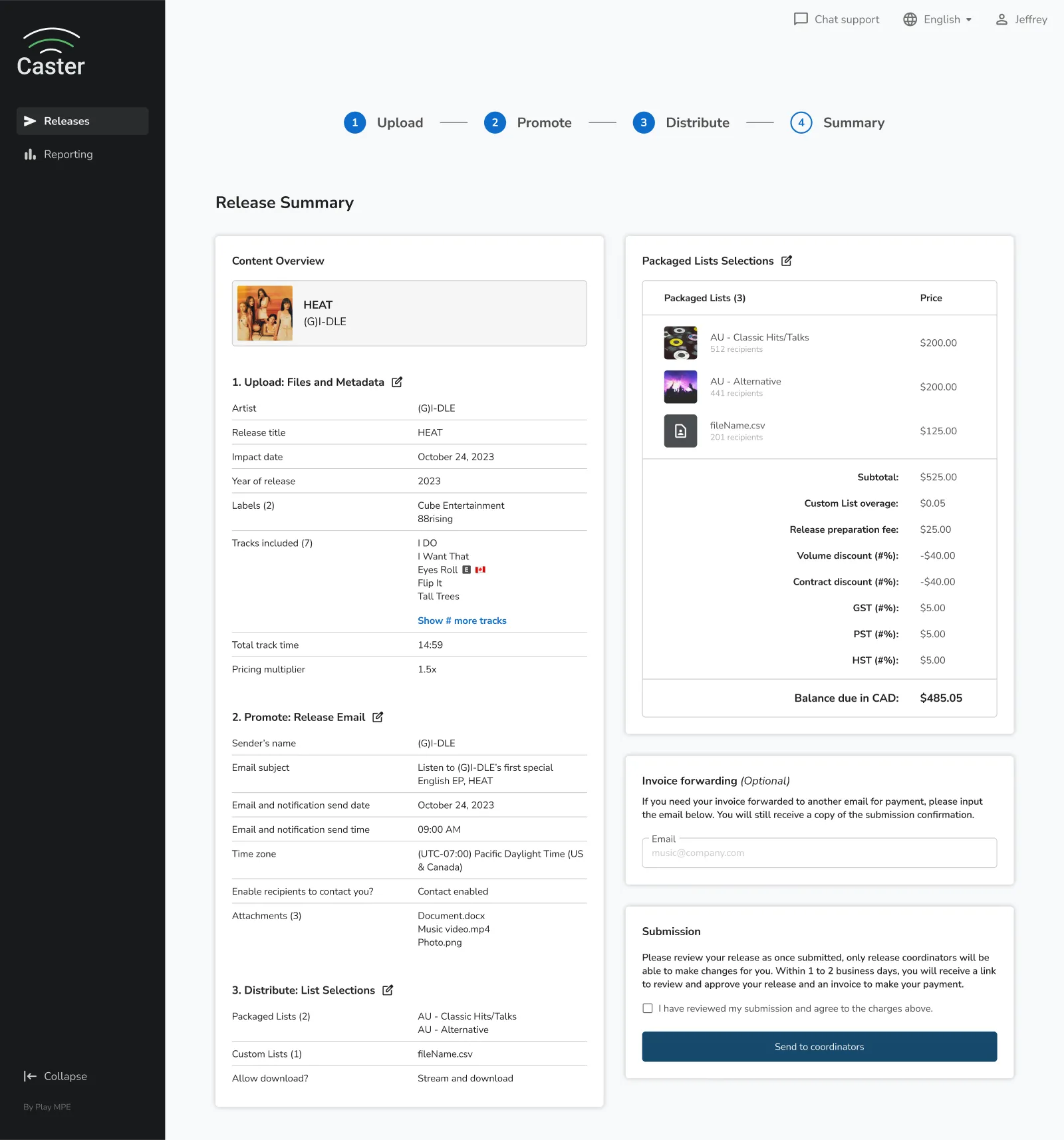
CASTER step 4: summary
Due to the bulk of the user-generated content in each step, we weren't able to bring forth same-page editing, but the refactor did allow us to take the users back to a previous step where they could make changes. This also fell into discussion of what a summary should contain as without going to the extremes of redundancy, especially with data-heavy content like a release.
For instance, each song of an album could encompass their own metadata. If a client wanted to update that, it made more sense for them to go back to the source of the issue. This page would be less of a summary if rehashed information was overloaded.
The right side of the summary page was also a pipe dream turned into reality — finally letting users get a glimpse of finality with their release creation submissions. Long gone are the days of ambiguous invoices. Clients finally had the knowledge what they'll be charged for and what they were getting.
And that's as far as my contributions went before my departure at Play MPE!
Results
The new Release Creator allowed the company to scale
The truth is, when a product isn't given love for over a decade, the bloat and clunk starts to add up. One of the main goals for the overhaul was to revisit and automate areas to create efficiencies that respected the time of both clients and internal teams.
First off, the Save as Draft was a feature requested for over 3 years, and once shipped, it was used over 423 times in the first week. Before, users would have to keep their web browser open and stay active to prevent being timed out. Otherwise, their release vanished and work would have to be done from scratch.
Second, we eliminated nearly all email and phone correspondence from the Ops team for client input on distribution packages selected. This was directly a result from decoupling the need to rely on an external PDF for distribution selection. The descriptors that we appended to each package also reduced BusDev's time on package education by approximately 1/3 of the 1 to 2 hours they normally spent per client. That's up to a whole 40 minutes per client!
Third, by including pricing into the packages, the Ops team no longer had to manually assemble invoices, cutting down the 1 hour they spent for assembly, invoicing, and outreach, for each release.
In a release, the Ops team used to send 4 separate emails to notify the client that their submission was received, their release was assembled, approval for distribution, and their invoice. With the new designs, clients only receive 2 emails, consolidating like-steps to minimize information overload.
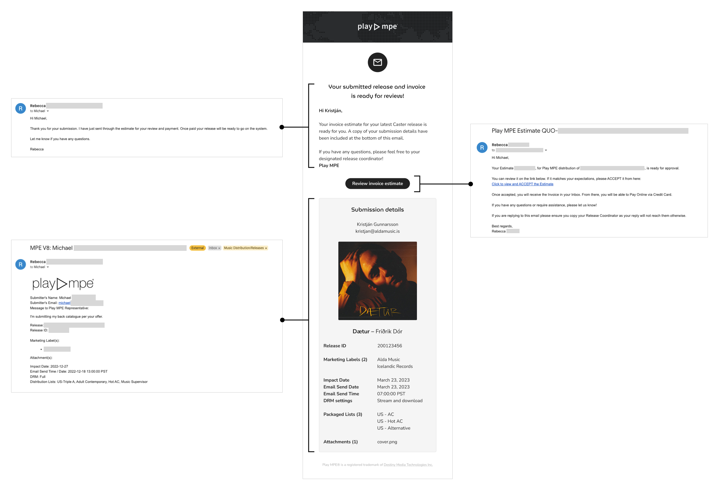
reducing various emails into a single email
While there is still much to be done with Caster and the completion of Phase 4 and beyond, the updates and new addition to the Release Creator had brought it miles ahead. It gives way to Play MPE being able to scale as a business, without creating a dependency on internal teams to support every direction a client chooses to take. Alleviating this behavior helps everyone come out on top!
Reflections
Casting away my thoughts
Caster was (and still is) a historical beast, with its base code dating back to the early 2010's. It had not been given many opportunities to shed away old code and flows. As a result, many of the dreams and asks bestowed upon it were simply just that — dreams.
In the example of Angular and React pages, simple features often required incredibly complicated workarounds, which often yielded "no's" from around the room, because it would come at the expense of taxing labor from Frontend or Backend Developers.
The experience of having to design among a sea of rejection was also taxing. Although there were absolutely limitations in the language, there was also a normalized culture of not tackling challenges because of perceived difficulties. In instances where they were tackled, sometimes the output was haphazard or not to design agreement, but these are learned behaviors that take time to shed (see: Play MPE overview or Top Charts). In those instances, I only had so much to give to Caster and its users.
My time with Caster was a story of emerging evolution. I gave the platform a taste of what thoughtful design and experience crafting could look like. But, so much of that effort is due to the pixel-pushing that I had to advocate with the designer and our Product Manager. At the end, there will be days where it sees greatness and days where it doesn't. Whichever case, a group effort will continue to be needed, because it can only thrive as much as what those around will put in!
© jeffrey chan, 2026.