PLAY MPE
Tonality Design System
A design system built in collaboration with Developers using modular and atomic principles to expedite the design-to-production process.
Role
Primary creator and owner of design system for first launch. Collaborated with Developers to build feasible components, and supported their adoption of the system.
Team
Myself (Primary Designer), Elvina P. (Co-Designer past first launch), 3 Product Managers, 8 Developers, 1 Quality Assurer.
TIMELINE
First launch: 4 months. Post-launch is a living project.
Overview
The Tonality Design System is the design language used across digital products at Play MPE. It is a library of components created at an atomic level to ensure modularity in its application to product design and experiences. It includes guidelines on typography, color, grid structure, iconography, and most importantly, it contains components that have been made in collaboration with Developers to ensure build feasibility.
I pioneered the initial phase of the design system over 4-months, establishing the logic, patterns, and scale of the most common elements used throughout the existing products. This mainly included buttons, text fields, dropdowns, banners, checkboxes and drag-and-drop upload areas.
Beyond the first launch, the Tonality Design System was maintained as a living artifact, where I worked with the other Designer to create components as needed for upcoming projects and features.
OVERVIEW OF TONALITY DESIGN SYSTEM
Context
Creating a common language for all products
In 2023, one of the Play MPE products still ran on a fairly dated-looking interface. Due to long runs of Play MPE not having a designer, some of the interface designs were done by Developers. Although they're good attempt from a non-design background, there are improvements that could be made to create a cohesion among the platform's experience.
Below are some of the various older interfaces that a user would encounter when using Play MPE products (all live and functioning concurrently).
Below are some of the various older interfaces that a user would encounter when using Play MPE products (all live and functioning concurrently).
Self-service Caster: Asset information
Self-service Caster: Template creation
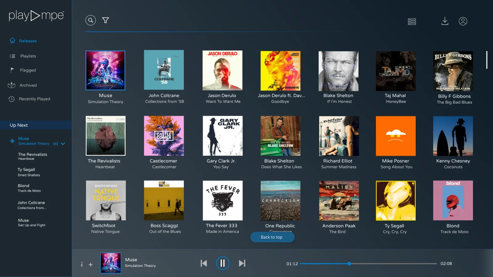
Player: Homepage
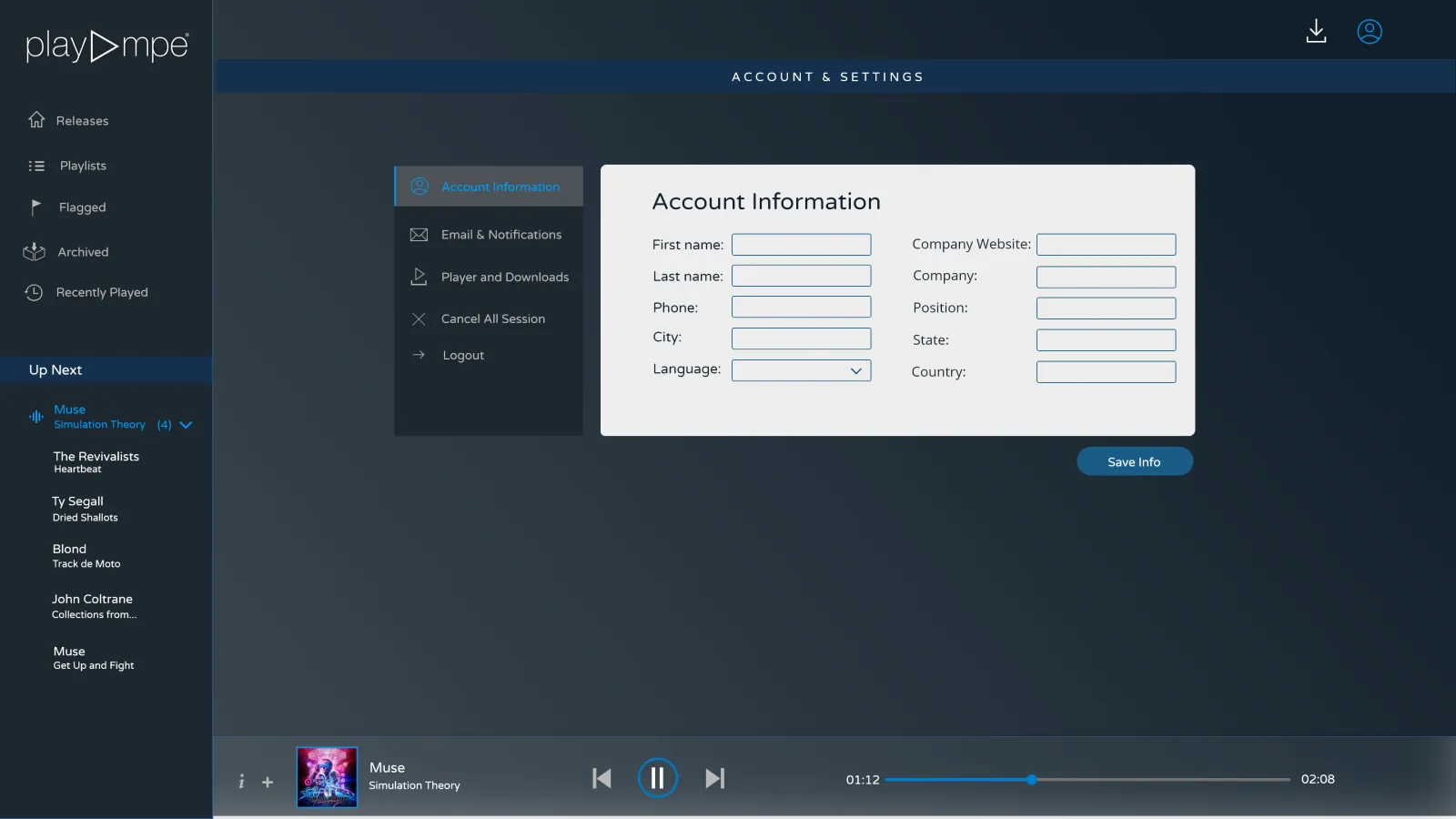
Player: Account settings
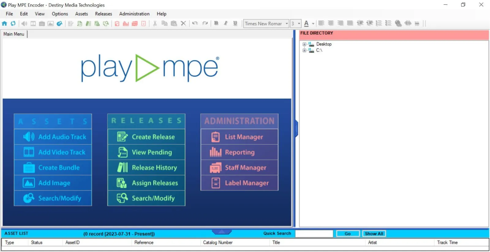
Encoder: Splash screen
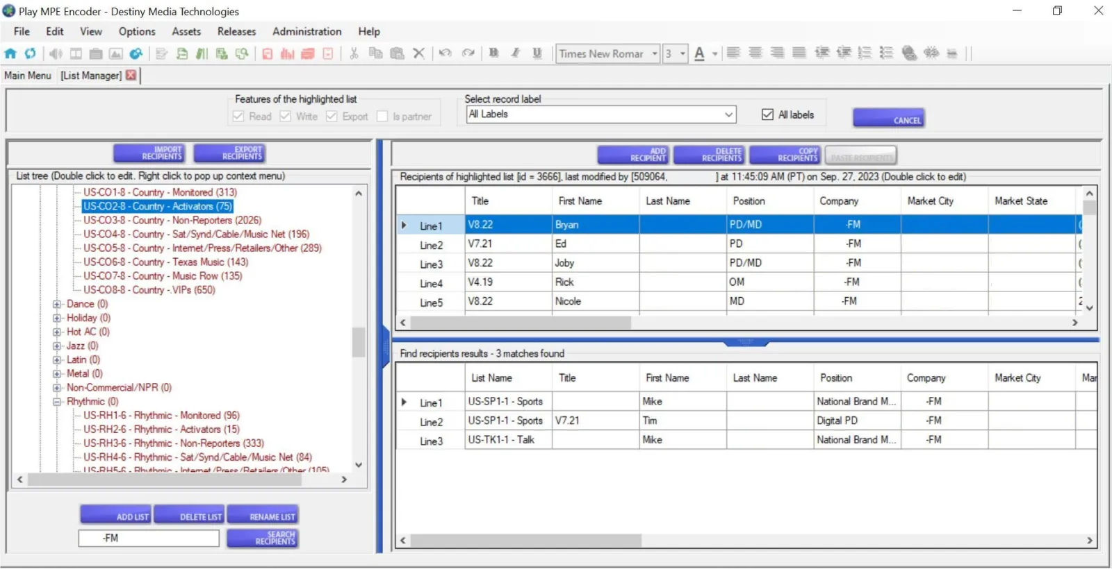
Encoder: Contact management
When I joined Play MPE, the Director of Product understood that a design system built thoughtfully and strategically would support design turnarounds and integration, especially created in collaboration with Developers — allowing both teams to work with established common ground. With my strengths in visual design and planning, I was brought on board to Play MPE with the hopes of establishing a design system to bring unity across the product touchpoints.
problem space
Past circumstances have led to a product with inconsistent fidelity and design choices. How can Designers and Developers create agreement with design, code, and communication to improve product presentation?
RESEARCH
Using Heuristic Evaluations to audit for improvements
As I was brought onto a product with an existing interface, before any sort of building, I completed a design audit, loosely following Jakob Nielsen's heuristics to grade needed improvements and usability violations among flows and patterns. This was also an opportunity to experience Caster for the first time.
Although the goal of this design system was to unify all three Play MPE products, I primarily focused on the language found among the largest platform — Caster, the company's revenue generator. The other products, Player, was stuck in maintenance-mode for nearly 2 years, and MTR was in the early stages of algorithm development.
Although the goal of this design system was to unify all three Play MPE products, I primarily focused on the language found among the largest platform — Caster, the company's revenue generator. The other products, Player, was stuck in maintenance-mode for nearly 2 years, and MTR was in the early stages of algorithm development.
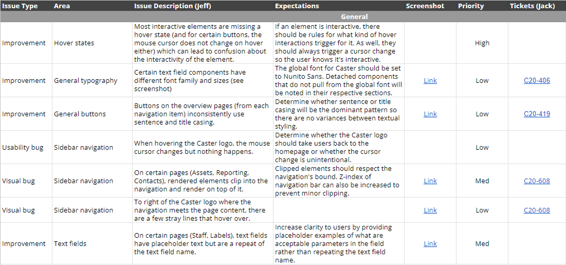
spreadsheet of heuristic findings
I categorized my audit findings based on different areas of Caster. For issues separate from Epics (the mother duck of projects), I worked with our Angular Expert to create acceptance criteria (ACs) for the fix. The chart above is a small sample of issues that pertained to Caster, linked with a JIRA ticket that rehashes the problem and fix.
Overall, one major finding from the design audit was the lack of consistency in atomic (small-scale) patterns across pages of the same product — icons, colors, even fonts. This is when I learned that Caster (and Player) were designed with a mix of AngularJS and React, both of which represent different design and development periods at Play MPE.
Overall, one major finding from the design audit was the lack of consistency in atomic (small-scale) patterns across pages of the same product — icons, colors, even fonts. This is when I learned that Caster (and Player) were designed with a mix of AngularJS and React, both of which represent different design and development periods at Play MPE.
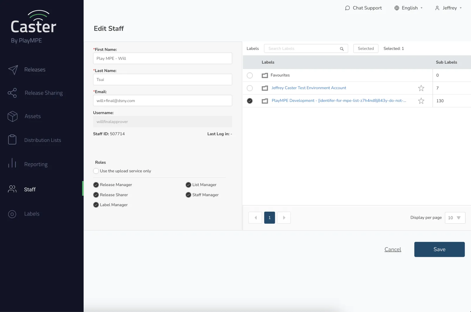
Self-service Caster: Staff page (Angular)
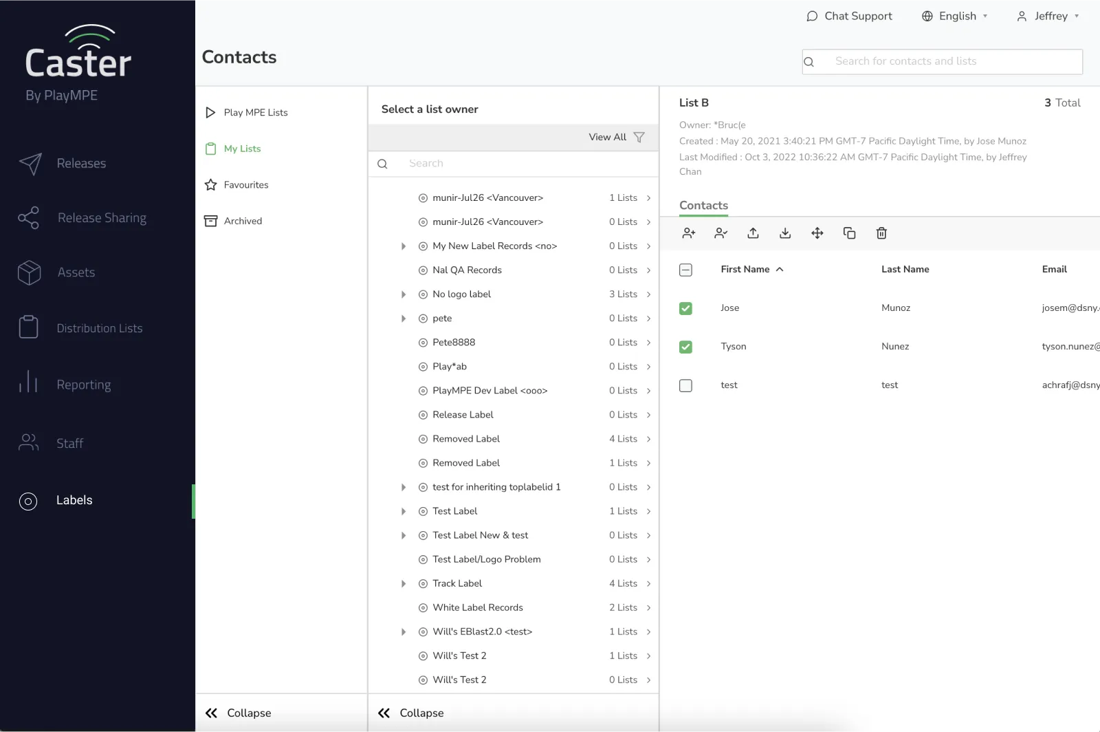
Self-service Caster: Contacts page (React)
Angular pages were deemed as being extremely dated — lacking basic accessibility standards including hover and feedback states, proper scale and legibility, and consistency among each other. Designs in React were slightly more modern, but many components still lacked hover and feedback states as well.
For the Development team, their goal was to incrementally move each project over to React, as AngularJS was a dying language.
For the Development team, their goal was to incrementally move each project over to React, as AngularJS was a dying language.
LIMITATIONS
Compromising to minimize developer debt
Unfortunately, Play MPE lacked the manpower to convert away from Angular and into React. The Development team estimated 2.5 years for a rewrite — a bid only possible if no new features were released.
After many discussions, Design and Development came to the compromise that the solution for the design system would lead from existing React components and previous design aesthetics to minimize developer debt.
The style sheet below are aesthetic directions from the previous Designers.
Some components were implemented, but there were also ones created too far ahead of the product cycle that conditions for their requirements would change by the time they were needed. Between the already-implemented React components and the stylesheet, this was my starting ground for the design system.
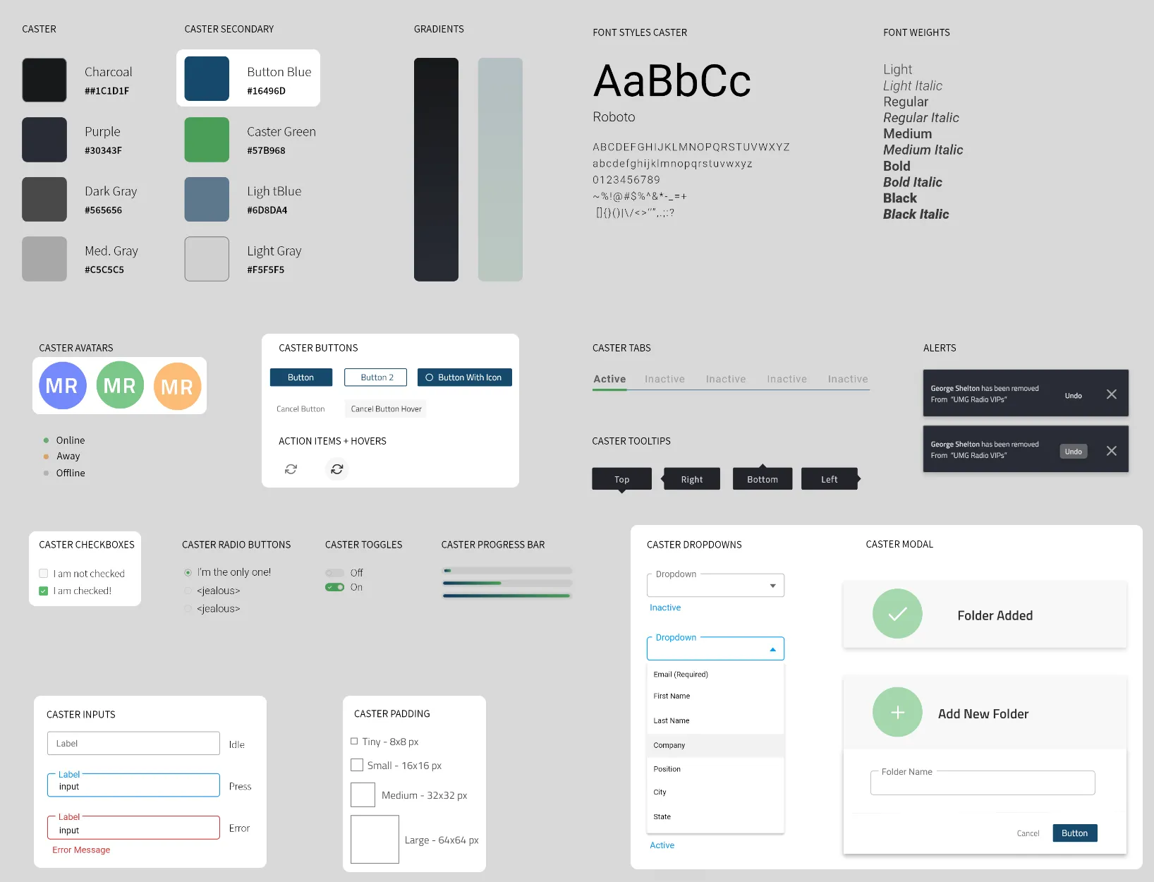
a one-page style guide of previous components
Atomic Principles
Establishing color palettes
Colors are core fundamentals to a design system. It reinforces branding, contextual cues, and visual impact. Of the eight colors documented, Button Blue ■ and Caster Green ■ are actually part of Play MPE and Caster's brand and identity, but are listed as Secondary Colors. The remaining colors were not found in the code, but similar alternatives were being used — though the image is not conclusive of all that was used.
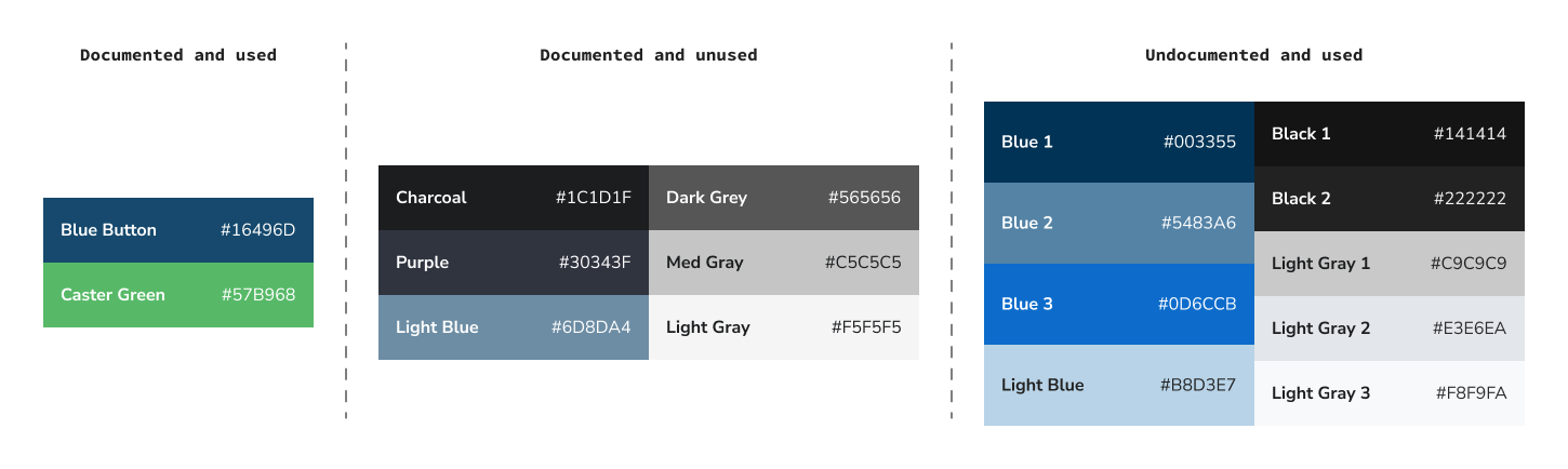
colors documented in style sheet and in code
There were instances where different blues were used for the same context like default button styling, but adjacent and unused colors had potential for visualizing subtle changes like interaction states. This was an opportunity to standardize the palette to reduce inconsistent use, while improving color representation for missing states like Hover and Focus, as found in the audit.
Because minimizing developer debt was crucial, heavily integrated colors in existing components needed to be a part of the new palette to help Developers minimize the number of changes. Global styles were loosely used, so replacing heavily used colors would take a lot of manual labor — and this option was only reserved if Design could not give that flexibility.
For the new palettes, I used a color generator to create 10 shades and tints for our required colors, and I slotted in existing colors to its closest match and manually adjusted neighboring colors for a better transition. Although it wasn't a perfect science, it worked for our circumstances and also limited Developer labor for color replacement.
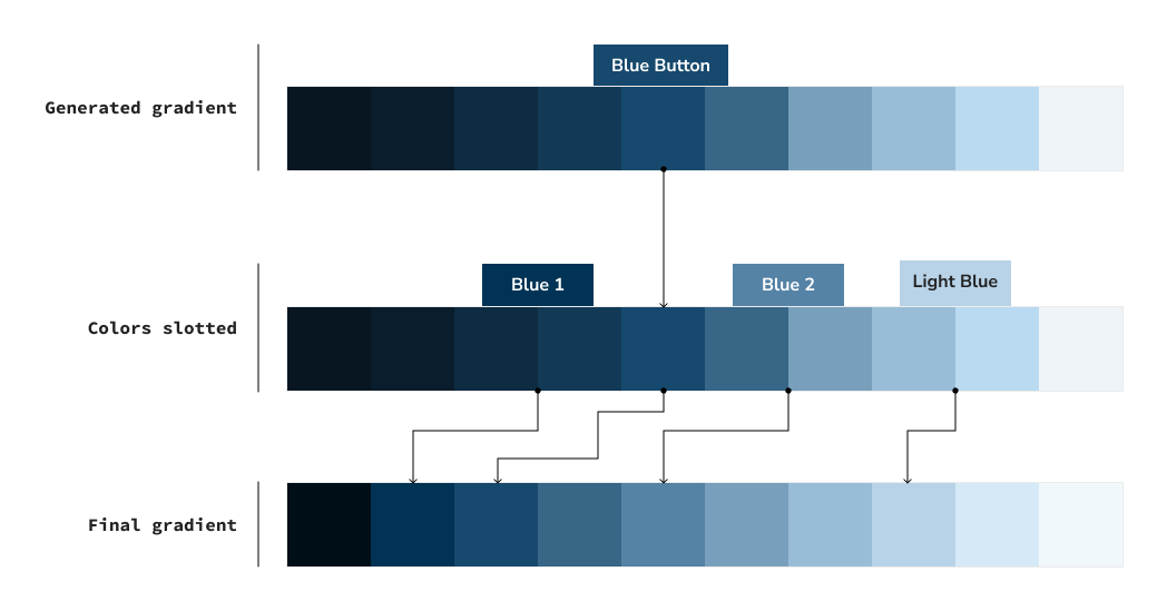
colors documented in style sheet and in code
You'll notice that the leftmost segment of the gradient has a stark jump between the first and second color. In testing, the visual prominence of jumping between darker colors felt less apparent than jumping between colors in the middle and beyond, so the Developers and I agreed to slash the number of dark tones represented. Although their absence doesn't entirely futureproof, they can be added at a later date. However, given the context of Caster, it just wasn't something that was necessary and would've added bulk.
Once the palette was defined, I needed to name each color so that anyone using the design system isn't arbitrarily referencing the whole palette as blue. Because this particular palette was branding color, we renamed it Caster ■.
Our colors were assigned numbers from 10-100 to indicate the value of darkness and lightness, borrowing from RGB color logic where lower values are darker and higher values are brighter. By updating the color naming convention to be increments of 10, it also allows for us to integrate new colors in between jumps if needed in the future — like the dark jumps we omitted.
In the end, the Blues were reworked to become Interact ■ — the primary color associated to interactions of non-branded elements. The Greys were expanded to become two palettes: neutralW ■ and neutralC ■, to include warm and cold tones.
IMPLEMENTATION
Building components
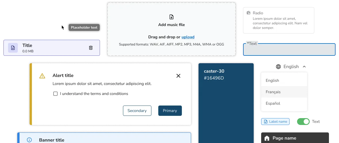
Text fields were the most extensively used component in Caster. As the style was partially determined, I worked within these parameters to create fully adaptive text fields. This meant accounting for fields to have active, focus, and hover states, the addition of leading and tailing icons, any interactive functions, and so forth.
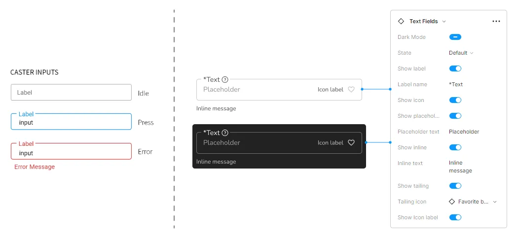
BEFORE AND AFTER: TEXT FIELD COMPONENT
When designing components, I referenced existing design systems such as Material Design (Google), Carbon Design (IBM) and Polaris (Shopify) as my main guide. The first two were particularly resourceful for their presentation, as the documentation was thorough at exemplifying the checklist of a completed component.
When it came to presenting the components and validating their feasibility, I made sure to prototype demos for Developers so they understood the intended outcome and could assess for any limitations that would occur in development.
When any component was added into the Design System, it was presented in an exploded view so viewers can see at a glance all the variations.
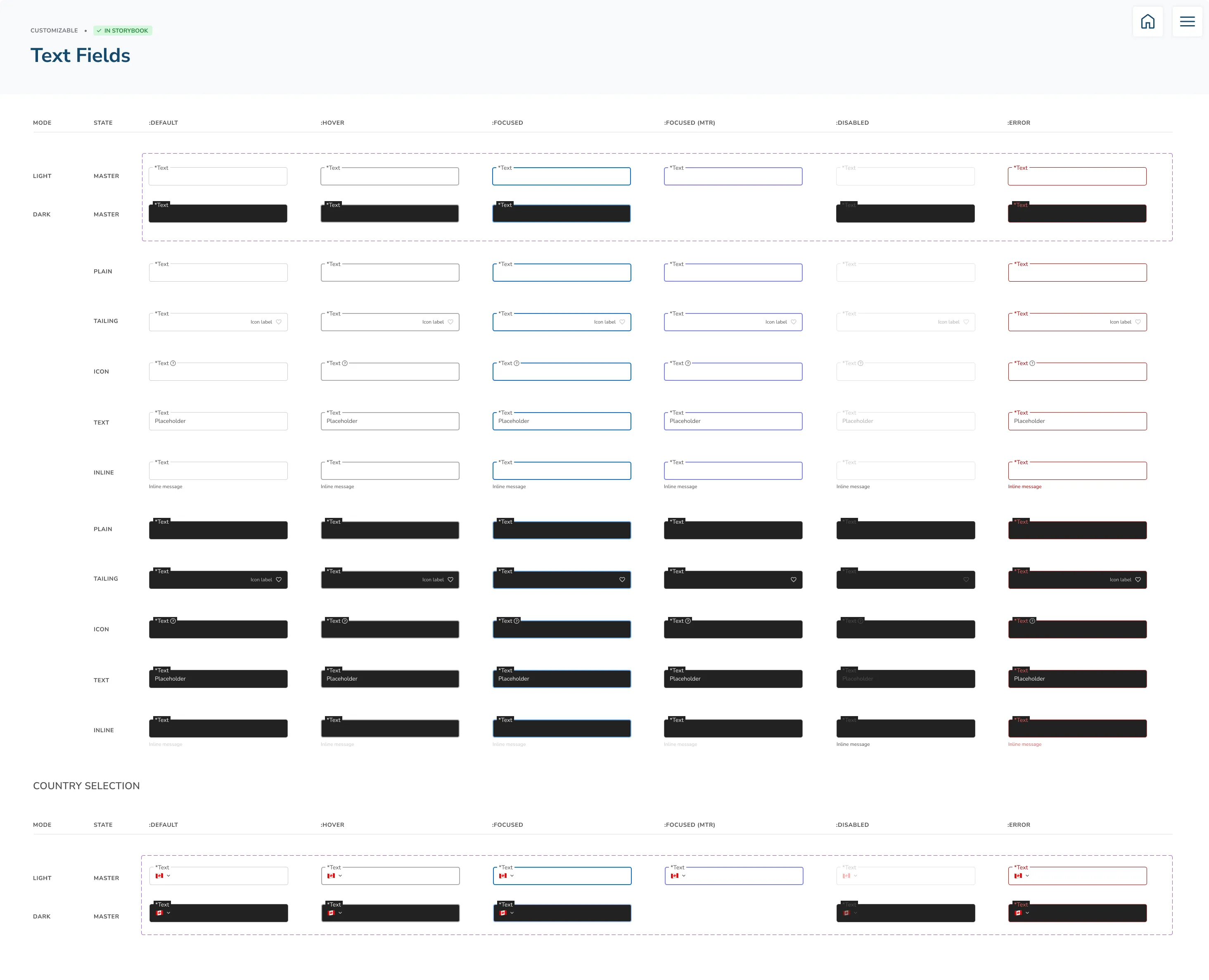
Text field component: exploded view
Fully designed components were made to be as adaptable in Figma, ensuring that each component had interactive properties that could adapt to its use case. These properties were based on known or anticipated circumstances of what was needed.
For the Design team, this allowed us to generate new features and flows with speed in high fidelity, as we weren't reinventing the wheel each time; The components we played with and used in our designs had been agreed upon in logic and functionality with Developers.
For the Design team, this allowed us to generate new features and flows with speed in high fidelity, as we weren't reinventing the wheel each time; The components we played with and used in our designs had been agreed upon in logic and functionality with Developers.
DISTRIBUTION
Managing components and supporting its adoption across teams
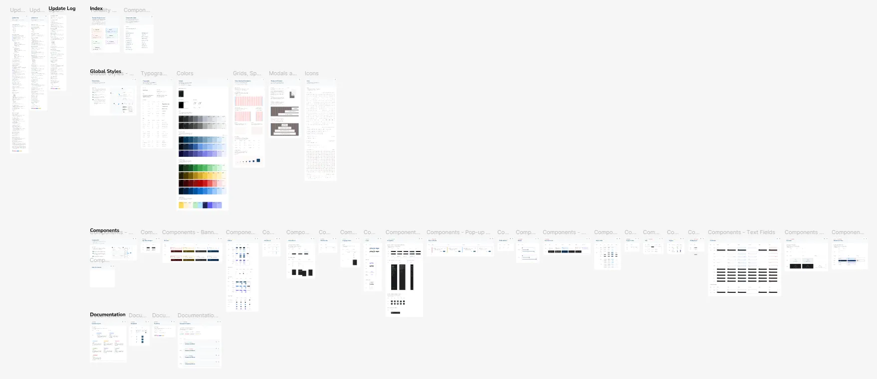
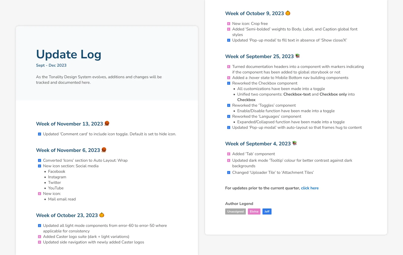
The update log in Figma
First, Designers were required to note all changes and additions made to the design system with the Update Log. This kept track of what moved in and out, and assigned an owner to the changes, so the main Designer could be reached for specific inquiries.
Changes to components had to be discussed among Designers and Developers to ensure the approach was justified and in compliant with agreed principles. It also facilitated discussion for what the requirements were and was an opportunity to talk through possible oversights or alternatives. Once a component was finalized, it was up to the Designer to work with their Developers and Product Manager to push changes live.
P.S. Our assigned colors are not gendered — they're just our favorites :P
design system's update log
JIRA Tickets
In Jira, we paired new components with build requirements to a parent project it would debut within. These details would include whether it existed in some capacity, is missing certain features, or needed to be built from scratch. It falls on the Designer to indicate what was needed, but the Developer was also ultimately responsible for delivering a functional component in relation to the mockups.
In Jira, we paired new components with build requirements to a parent project it would debut within. These details would include whether it existed in some capacity, is missing certain features, or needed to be built from scratch. It falls on the Designer to indicate what was needed, but the Developer was also ultimately responsible for delivering a functional component in relation to the mockups.
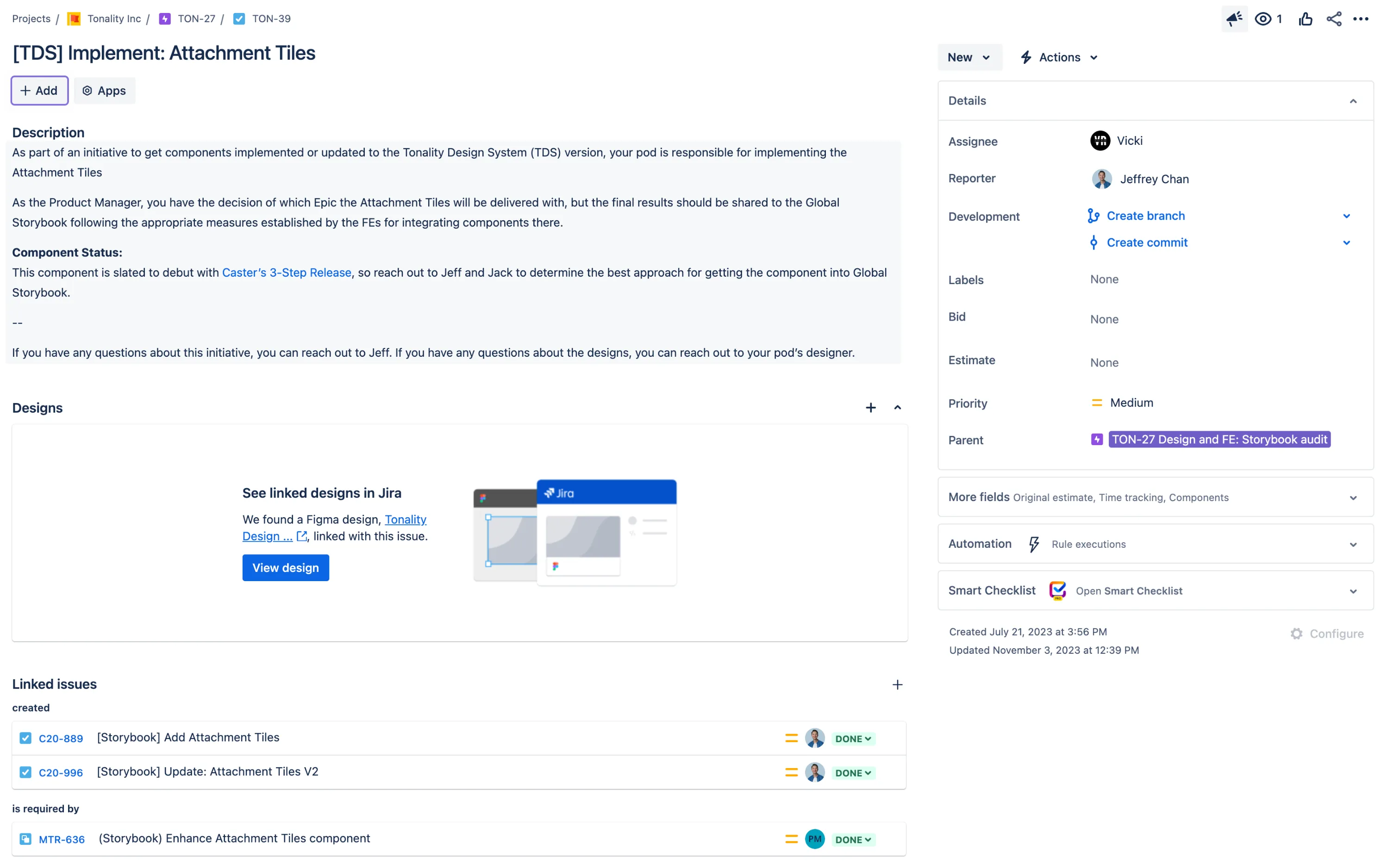
JIRA tickets for component implementation
Storybook
Rolling out the design system meant that Developers needed a way to track components being created, so they could also streamline their processes and only have to build thoroughly once. This was done through the adoption of Storybook.
Whenever a component was released, a Developer would add it to Storybook and made all customizable features available to other Developers for development reuse. This step was completed once the component was peer-reviewed by a Designer and another Developer.
Although Storybook was a tool in circulation prior to the Tonality Design System, Developers had previously thrown everything in there with no other details. This resulted in multiple versions of the same component with different finishes, defeating the purpose of reusable components and ease of use. The Design team identified archivable and reworkable components, while also organizing the system so that the Developers could successfully implement vetted components into their workflow.
Reflections
Looking back on the design system
For the Design team, the biggest benefit was the saved time for mockups and prototypes. Everything mostly existed in hi-fidelity as many components had been validated in its conception. It streamlined Stakeholder feedback too, as they felt confident in providing notes without holding back critique because of placeholder material or ambiguity.
For Developers, because they were involved in the design direction for component building, there were less knowledge gaps for where it goes, what it did, and how it functioned. It encouraged them to use designed components, as opposed to creating one-offs. This helped foster the common design language we wanted to build. With our resources coming from the same place, it minimized the discrepancies found between design and build.
Although the benefits of having a design system far outweighed the eras without one, not everything worked as a seamlessly either.
In trying to save on developer debt, issues were also created when we tried to pivot existing components for adaptation. Sometimes trying to tailor a previous component without rebuilding it from scratch resulted in more work because of the way it was coded or where it was used. There were cases where even though the idea was the same, the implementation wasn't necessarily a 1-to-1.
Another limitation was the absence of design tokens, which helps to create a single origin for design decisions that are populated into the design system and live products. The upfront cost of implementing design tokens didn't necessarily make waves because the design system had always been a Design-led initiative, even if we brought on Developers as collaborators. In order for design tokens to exist, it would include reworking Developer language and workflow, and that would be something they'd need to be equally passionate about improving.
Nonetheless, the adoption of the Tonality Design System was a step forward towards design advocacy as it created a better collaborating experience for both Designers and Developers. It also worked to the benefit of faster prototyping and shipping times, which was a net positive. In any case, the design system can only continue to grow as long as there's a shared agreement to upholding its language and principles.
© jeffrey chan, 2026.